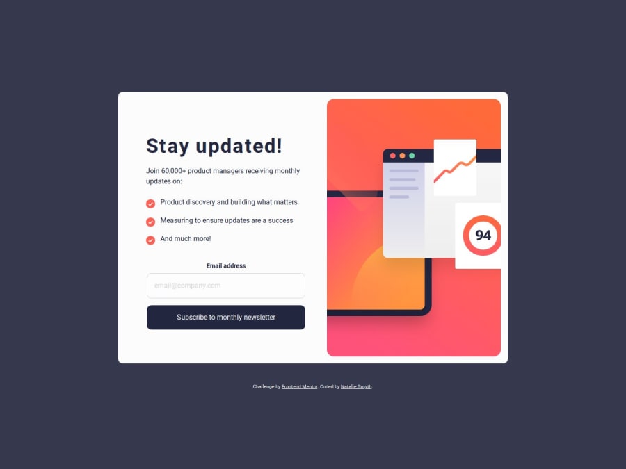
Responsive newsletter signup page using JS and CSS flexbox
Design comparison
Solution retrospective
When I first looked at this challenge, I thought it would be relatively simple, and that I could complete complete the task in less than a day's work. I was wrong.
What challenges did you encounter, and how did you overcome them?Unsurprisingly, the problem came with getting the invalid form state to look right. It took so much longer than expected to get the icon, border, and text to show up in the right place; the icon wouldn't show up and it took an unreasonable amount of time to realize that it was showing up, it was just much farther to the right than expected.
What specific areas of your project would you like help with?I am content with where it is as an MVP, but not a final draft. If anyone has any resources on styling forms, or can point me in the direction of what knowledge I'm lacking that is making this so difficult would be much appreciated.
Community feedback
- @Sandiso-devPosted almost 2 years ago
hi there from what I think you can most likely do is to add the message manually right on top of the input with your preferred styling then manipulate It in JS by displaying it conditionally when the input is invalid.
0
Please log in to post a comment
Log in with GitHubJoin our Discord community
Join thousands of Frontend Mentor community members taking the challenges, sharing resources, helping each other, and chatting about all things front-end!
Join our Discord
