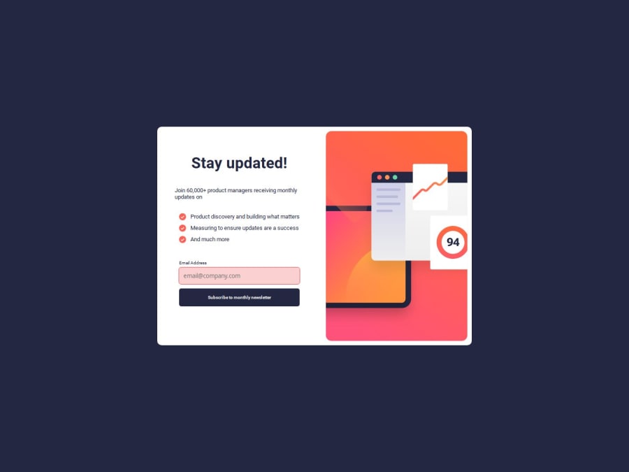
Responsive newsletter sign-up page, using HTML5, CSS3 and JS.
Design comparison
Solution retrospective
Well, I did everything using pure HTML5, CSS3 and JavaScript, no library needed, and I feel good about that. I feel like, for the vast majority of projects, that's simply enough.
Regarding a different approach, well, I'd probably use the BEM pattern to better organize my CSS stuff. I'd probably try a mobile-first approach as well.
What challenges did you encounter, and how did you overcome them?Validating the user input and replacing the info cards was something not obvious at first glance, but gladly JS nowadays offer, built-in in its DOM API, methods that easily get the job done (for more details, check out the README of this project, on Github).
What specific areas of your project would you like help with?I used pixels as the main unit of measurement, for most of the sizing I did; not sure if using em, or rem, for example, are generally better approaches.
I could've used more fitting methods, maybe, when validating the user input.
Community feedback
Please log in to post a comment
Log in with GitHubJoin our Discord community
Join thousands of Frontend Mentor community members taking the challenges, sharing resources, helping each other, and chatting about all things front-end!
Join our Discord
