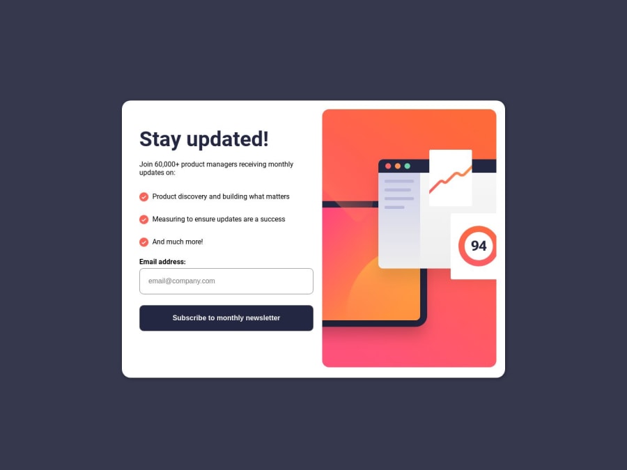
Responsive Newsletter Sign-up || HTML, CSS and JAVASCRIPT


Design comparison

Solution retrospective
i'm having some trouble to make it responsible on mobile devices. Using the inspector from browser, on some greater height-pixel devices, like Iphone XR (414px), there is a "border" on top and bottom. Lesser than 414px looks good on most of then.
Community feedback
- @Danii215Posted over 1 year ago
Great job with your project! The reason you're having a "border" on top and bottom of some smaller screens is because your container has min-height. Removing this property from .container will remove the top border. To fill the remaining space at the bottom, your <body> tag should have a height of 100vh, to fulfill the whole screen's height available, set the display to flex, flex-flow (or flex-direction): column, and then set your <footer> to height: 100%. This makes the <body> a flex container and each element inside of the <body> will be placed in a column. By setting the footer's height to 100%, the footer will try to fill as much space as it can, thus filling the "border" on the bottom. You can then centralize the text in the footer with line-height: 1.7rem. Remember to do all these fixes within your preferable @media query size.
Marked as helpful0

Please log in to post a comment
Log in with GitHub
Join our Discord community
Join thousands of Frontend Mentor community members taking the challenges, sharing resources, helping each other, and chatting about all things front-end!
Join our Discord