Design comparison
Solution retrospective
Hi everyone!
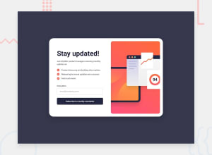
Had a lot of fun with this challenge and certainly learned a lot. My solution certainly isn't pixel perfect and I made a few small changes myself. For example, I added a feature that makes the input box glow green when you have a valid email inputted. On the mobile success page, I have my icon and text aligned flex-start even though it appears the challenge has it more centered. I liked the look of it aligned to the top more and didn't feel the center alignment worked as well for me.
Any and all feedback and advice is very much appreciated! If there is anything in my code that could be cleaner or anything that could be simplified that would be fantastic.
Thanks everyone!
Community feedback
Please log in to post a comment
Log in with GitHubJoin our Discord community
Join thousands of Frontend Mentor community members taking the challenges, sharing resources, helping each other, and chatting about all things front-end!
Join our Discord
