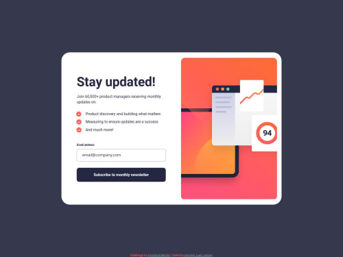
Submitted over 1 year agoA solution to the Newsletter sign-up form with success message challenge
Responsive newsletter sign up with success message main with flexbox
@Juan122113

Solution retrospective
What are you most proud of, and what would you do differently next time?
I'm proud in the fact this was my first formulary made it in a formal web page, and it was not easy.
I will do different the URL of the images, adding the root folder manually, if not, the images not load.
What challenges did you encounter, and how did you overcome them?The JS was difficult. I spend time figure out how to fix it.
What specific areas of your project would you like help with?Any comments are welcome.
Code
Loading...
Please log in to post a comment
Log in with GitHubCommunity feedback
No feedback yet. Be the first to give feedback on Juan122113's solution.
Join our Discord community
Join thousands of Frontend Mentor community members taking the challenges, sharing resources, helping each other, and chatting about all things front-end!
Join our Discord