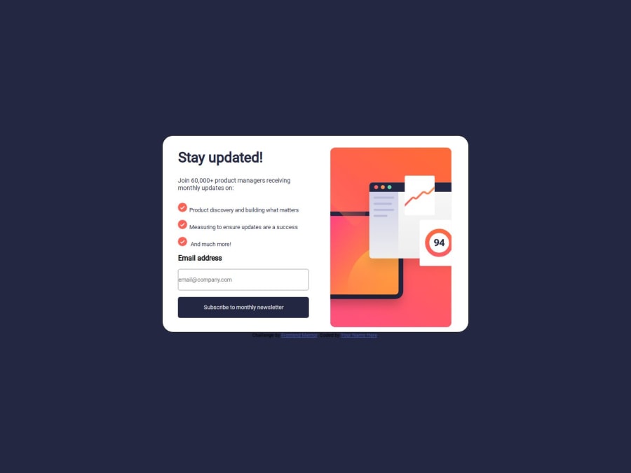
Responsive Newsletter sign-up form with success message with flex Box
Design comparison
Community feedback
- @ItsZubekPosted 5 months ago
The javascript part looks alright, however when the dismiss button is pressed the signup form re-appears but the sucess message stays where it was. Another thing is that whatever email I put in it still shows the default one at the sucess screen, it doesn't update automatically to reflect what email has been used in the form.
As for the CSS I see that you've ignored the mobile design completely. It is really important to practise both the desktop and mobile design and to think about it when creating the html layout to accomodate both cases if necessary. Some styles are off, for example the success message is not styled at all and looks very different from the design.
Overall it is a good project, but I would spend a little more time on getting the little things right as it will look better on your github.
0
Please log in to post a comment
Log in with GitHubJoin our Discord community
Join thousands of Frontend Mentor community members taking the challenges, sharing resources, helping each other, and chatting about all things front-end!
Join our Discord
