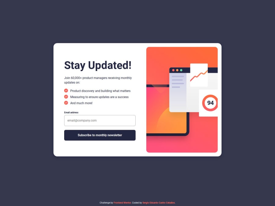
Responsive Newsletter Sign-Up Form with Scss and JS
Design comparison
Solution retrospective
Nothing in specific. It was a quick fun challenge. I proud that I tried to focus on future maintenance and flexibility by having a structure and functionality in a way that if more inputs are added it could still work with minimal changes.
What challenges did you encounter, and how did you overcome them?Nothing in specific.
What specific areas of your project would you like help with?Nothing in specific. But feedback is always welcome. :D
Community feedback
- @somayakhaledPosted 5 months ago
Hi, I hope this message finds you well. I wanted to provide some feedback regarding the button hover effect on the website. I noticed that the implementation does not align with the design we discussed. Here’s the code that shows the hover effect I was expecting:
button {
    background-color: $Dark_Slate_Grey;

    &::after {
        content: '';
        background: linear-gradient(to right, $pink, $Tomato);
        position: absolute;
        left: 0;
        right: 0;
        bottom: -.5rem;
        height: 12px;
        filter: blur(1rem);
        opacity: 0;
    }

    &:hover {
        cursor: pointer;
        background: linear-gradient(to right, $pink, $Tomato);

        &::after {
            opacity: 1;
        }
    }
}
Consistency in design is important for user experience, and I thought it would be helpful to bring this to your attention.
Thank you for your hard work!
Best regards.
0@SergioCasCebPosted 5 months ago@somayakhaled Hey there, thanks for pointing that out, I completely skipped over that design file without noticing.
0
Please log in to post a comment
Log in with GitHubJoin our Discord community
Join thousands of Frontend Mentor community members taking the challenges, sharing resources, helping each other, and chatting about all things front-end!
Join our Discord
