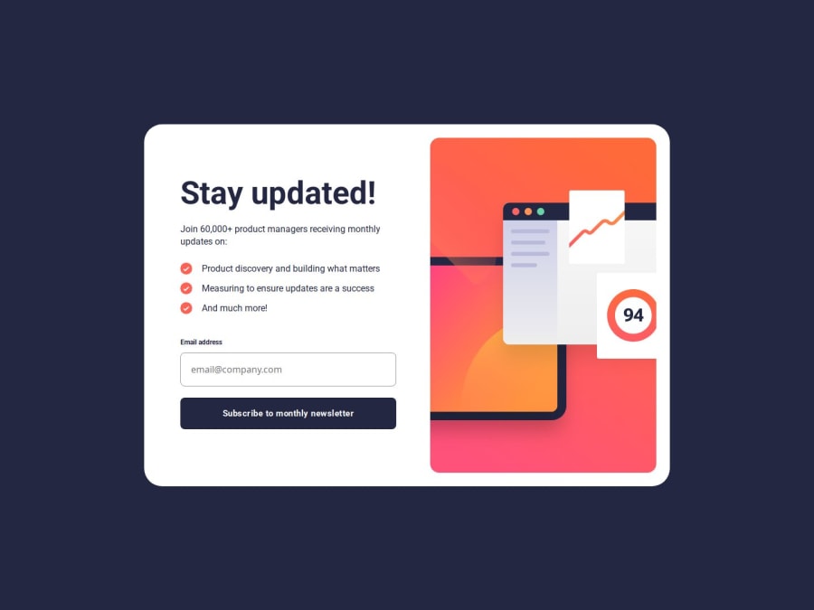
Design comparison
Solution retrospective
I'm proud of completing the requirements for the JS part.
What specific areas of your project would you like help with?I would very much appreciate any suggestions that could improve my skills.
Community feedback
- @adeyshPosted 20 days ago
Hi There. Your solution looks great. However here are some changes I could suggest looking at your code:
-
Your main component is a card rather than form so you could change the classes for that.
-
Try to use
picturetag for changing image based on screen sizes. -
The form should not involve any other content other than form fields. For other content you could make it card specific.
-
You don't have to use
spaninside anlitag. -
The html is semantic but could use some restructuring.
-
Try to use reset styles to help you with initial css styling.
-
Try to use rem and em units for sizing.
-
The component is not responsive according to the screen sizes. I think you need to look at them again. The containers overflow out of the screen on almost all screen sizes.
These were my suggestions for what I could infer. Good luck and keep learning!
0 -
Please log in to post a comment
Log in with GitHubJoin our Discord community
Join thousands of Frontend Mentor community members taking the challenges, sharing resources, helping each other, and chatting about all things front-end!
Join our Discord
