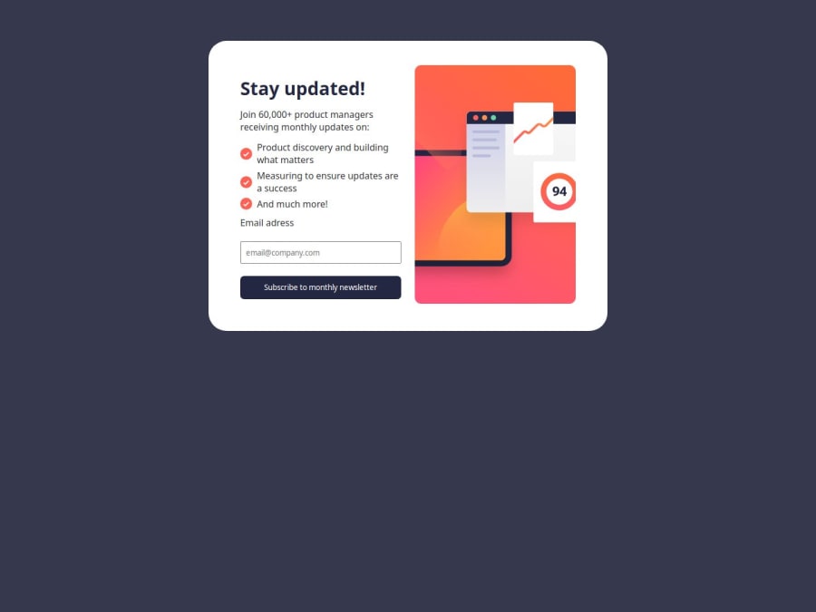
Design comparison
Solution retrospective
finishing it
What challenges did you encounter, and how did you overcome them?if you wanna see it, its in my repo README file go and read it
What specific areas of your project would you like help with?any help would be accepted
Community feedback
- @Swag-blipsPosted 10 months ago
Great work, here is my take
** SEMANTIC HTML: ** Use semantic HTML tags to improve the structure and readability of the code. For example, use <main> instead of <div class="main">, <section> for different sections of the form, and <header> and <footer> where appropriate.
** Accessibility: **
- Add aria-labels to interactive elements like buttons to improve accessibility for screen readers.
- Ensure all images have meaningful alt attributes to describe their content effectively.
- Use <label> elements to associate labels with form inputs for better accessibility.
** Consistency: ** Maintain consistent class naming conventions and avoid unnecessary abbreviations for better readability and maintainability.
0
Please log in to post a comment
Log in with GitHubJoin our Discord community
Join thousands of Frontend Mentor community members taking the challenges, sharing resources, helping each other, and chatting about all things front-end!
Join our Discord
