Design comparison
Solution retrospective
-
I'm very excited that I built this project because it helped strengthen my layout skills and I learned a lot. I watched a tutorial on CSS Grid and practiced my newly learned skill with this project. It was a bit difficult at first but I eventually figured it out.
-
I also came across the implementation of a responsive navbar for the first time. After watching some tutorials and reading various articles, I finally created my first hamburger menu. I'm very proud of myself.
-
I also came across dom manipulation in React with the useRef hook. Although I need to practice using it a bit more, it was nice to be introduced to it. I also came across z-index and overflow-x in CSS for the very first time. I'm feeling like a much better developer.
-
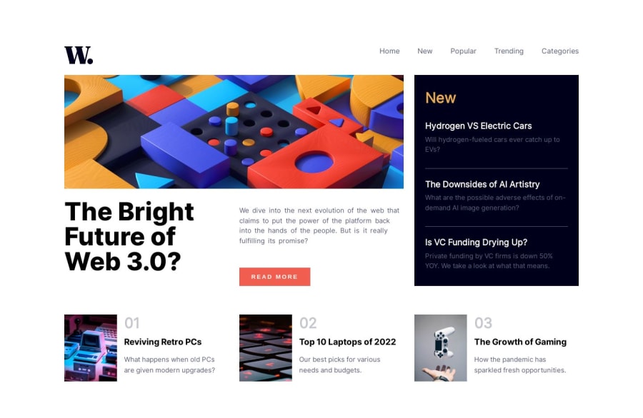
The only issue I battled was I wanted to make the design and my implementation picture perfect but I was not able to get the content in the aside of the article (New) to fill up and match just like the design given. Any suggestion about that would be appreciated.
-
I would love any other feedback about my code and best practices. I'm always looking to improve and any input whatsoever will be gratefully appreciated.
Community feedback
Please log in to post a comment
Log in with GitHubJoin our Discord community
Join thousands of Frontend Mentor community members taking the challenges, sharing resources, helping each other, and chatting about all things front-end!
Join our Discord
