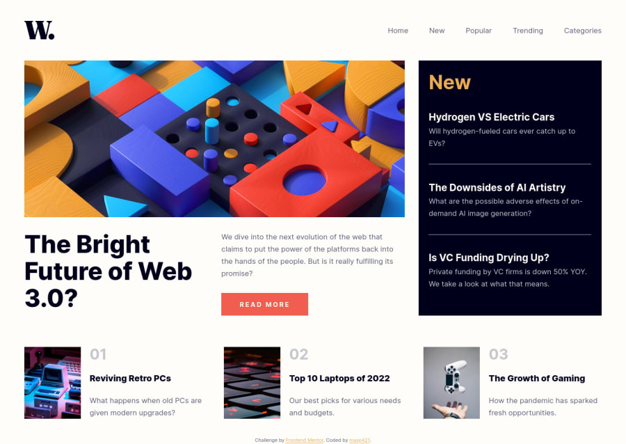
Responsive news-homepage using css flexbox, grid, semantic html5
Design comparison
Solution retrospective
My biggest challenge while building this project was using semantic html5 while following the accessibility guidelines. I am still not sure whether my markup is according to the best practices.
I tried my best to utilize the mobile first approach and avoid unnecessary media queries but I'm sure my css can be improved in many areas. I have a lot of unused utility classes, hoping to solve this issue once i learn sass/tailwind.
Any feedback regarding my solution, any bad practices or mistakes I made is very much appreciated!
Community feedback
- @maxp421Posted almost 2 years ago
Just noticed i forgot to add a darkening overlay over the remaining visible parts of the website when mobile menu is open. On my way to fix that along with errors that popped up in the accessibility report :-D
0
Please log in to post a comment
Log in with GitHubJoin our Discord community
Join thousands of Frontend Mentor community members taking the challenges, sharing resources, helping each other, and chatting about all things front-end!
Join our Discord
