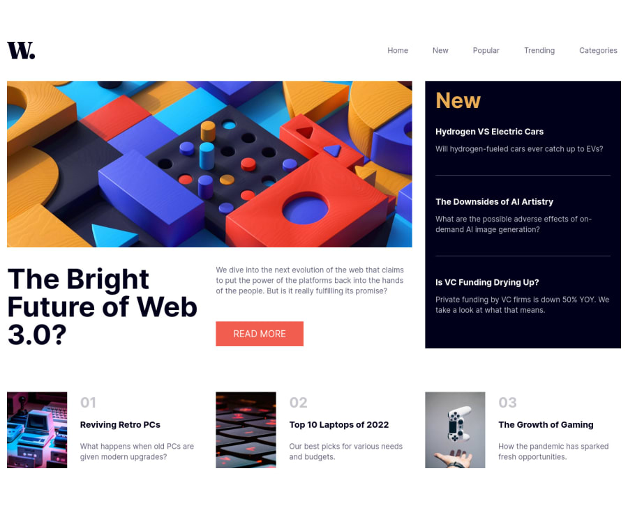
Responsive News Site Landing Page - Advice wanted


Design comparison

Solution retrospective
I have two parts I am struggling with...
-
On a mobile device (phone) there seems to be a bit of extra space left or right of the content as you can move the the screen left or right ever so slightly. Any idea what could be causing this?
-
I did not complete the bonus challenge of developing a functional burger menu but I did want the burger menu icon to display on mobile devices which I managed to do. However I am not able to combine it with the top nav to make both elements sticky so the navigation always appears at the top of the screen on mobile devices. What is the best way to hide and show elements such as the burger menu?
Community feedback
- @iamenochleePosted over 2 years ago
1)add to the body { width: 100vw; overflow-x: hidden} 2)There are several ways to toggle the navbar with knowledge of javascript. You can go all in using javascript just like this, make sure the navbar has a display of none in the css limited to mobile media query,
//grabing the elements,
const toggler = document.querySelector(".menu-toggler");
const navBar = document.querySelector(".list--container");
const body = document.body;
const icon = toggler.querySelector("img");

//opening navbar and closing navbar

/*creating custom function to handle the click*/
const handleOpen = (el) => {
  el.style.display = "block";
  icon.src = "./assets/images/icon-menu-close.svg";
  icon.alt = "Close Navigation Menu";
  body.style.overflow = "hidden";
};

const handleClose = (el) => {
  el.style.display = "none";
  icon.alt = "Open Navigation menu";
  body.style.overflowY= "scroll";
  icon.src = "./assets/images/icon-menu.svg";
};


toggler.addEventListener("click", () => {
  if (navBar.style.display === "block") {
    handleClose(navBar);
  } else if (navBar.style.display ==="none"){
    handleOpen(navBar);
  }
});

/*closing the navbar on click outside*/
navBar.tabIndex = 0
document.addEventListener("click", () => {
  if (
    navBar !== document.activeElement &&
    body.getBoundingClientRect().width < 720
  ) {
    if (document.activeElement !== toggler) {
      handleClose(navBar);
    }
  }
});
if you prefer a css approach you will have to add and remove a class of "open" to it when the button is clicked, the use that class to handle the display in the css.
Keep Coding,
EDIT: cleaned up the function
EDIT2: While that works it has a bug, you have to click twice to open the navbar at first , here is a new solution
//custom functions
function handleClose(el) {
  el.classList.remove("open");
}

function handleIcon() {
  if (toggler.classList.contains("open")) {
    icon.src = "./public/assets/images/icon-menu-close.svg";
    icon.alt = "Close Navigation Menu";
  } else if (!toggler.classList.contains("open")) {
    icon.src = "./public/assets/images/icon-menu.svg";
    icon.alt = "Open Navigation Menu";
  }
}

//toggling navBar
toggler.addEventListener("click", () => {
  toggler.classList.toggle("open");
  navEl.classList.toggle("open");
  handleIcon();
});

//closing on click outside
navEl.tabIndex = 0;
document.body.addEventListener("click", () => {
  if (document.activeElement !== toggler) {
    if (
      navEl !== document.activeElement &&
      document.body.getBoundingClientRect().width < 720
    ) {
      toggler.classList.remove("open");
      handleClose(navEl);
      handleIcon();
    }
  }
});

css

.open{
display: block}
Marked as helpful0 - @Chiemeka2006Posted over 2 years ago
@Tyrone Robertson the website looks really good but firstly in the mobile version the menu button doesnt work properly when i click on it the navigation doesnt pop up and also to make the website look smoother why dont u add a transition to the Read More button so it looks a bit smooth when u hoever over it . Hope this helps , have a nice day man .<£ ,3<3
0


Please log in to post a comment
Log in with GitHub
Join our Discord community
Join thousands of Frontend Mentor community members taking the challenges, sharing resources, helping each other, and chatting about all things front-end!
Join our Discord