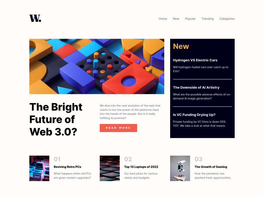
Responsive News Page Using Flexbox and Grid
Design comparison
Solution retrospective
At a certain point, my larger layout breaks between 751px and 1275px, how do I prevent that from happening and ensure things resize smoothly?
Community feedback
- @Cypher-amanPosted over 2 years ago
Hey, your project looks great but there are some suggestions I would like to make. . Your menu in the mobile version isn't hidden properly, you can scroll to the right side and can see your nav list there. You can fix this by disabling vertical scrolling. . You can decrease the margin between the main content and the header section. . The text in the sidebar(news feed) is too dark, try to use a different variant of the color provided in the style guide. . You can use multiple media queries to style differently for different widths. I think that will also solve your breaking problem. Also, I have completed this same project today, do check it out and share your thoughts and suggestions on my project with me.
Marked as helpful1@LunarianDreamPosted over 2 years ago@Cypher-aman I took your advice and went ahead and styled for tablet sized viewports and that helped tremendously. My images were also acting funny because of a object-fit property I used, but I resolved it, and its' mostly okay. I tried multiple times to get the horizontal scroll situation resolved for the menu and I managed it. I mistakenly styled the margins for the body and I shouldn't have done that as that caused me to have two vertical scrolls wheels: one for the body and another for the HTML doc itself. I'll never do that again. . . 😅. All in all things worked out. Thanks!
0
Please log in to post a comment
Log in with GitHubJoin our Discord community
Join thousands of Frontend Mentor community members taking the challenges, sharing resources, helping each other, and chatting about all things front-end!
Join our Discord
