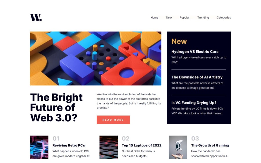
Design comparison
SolutionDesign
Solution retrospective
What are you most proud of, and what would you do differently next time?
Hello FrontendMentor!
This is my first whole page challenge on this site. I hope I nailed it without any bigger webdesign violations.
- I learned, how to handle openable and closeable nav menus on small screens.
- I played around/practiced with different layouts on in-between screen sizes
- Finally started to scratch the surface of container queries.
I did not like the layout on specific screensizes, and was happy to discover container queries.
What specific areas of your project would you like help with?As I am still new to web development, I happily accept any suggestions, corrections on my mistakes and good or bad practices.
Community feedback
Please log in to post a comment
Log in with GitHubJoin our Discord community
Join thousands of Frontend Mentor community members taking the challenges, sharing resources, helping each other, and chatting about all things front-end!
Join our Discord
