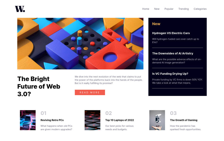
Design comparison
SolutionDesign
Community feedback
- @AndresFelipeForeroPosted about 2 years ago
Hi steve, how are you?
In this project you can try whith around 800px as media-queryx. In this way the page breaks a little less.
Good luck 👍
0 - @MaryamhusseinPosted about 2 years ago
Great !! but u forgot the responsive design (the media query )
0 - @AdrianoEscarabotePosted about 2 years ago
Hi Steven Croft, how are you? I really liked the result of your project, but I have some tips that I think you will enjoy:
I noticed that in higher resolutions, the content is stretching a lot to fix this we can use a max-width on the content that we want to have a maximum width!
body {
    max-width: 1440px;
    margin: 0 auto;
}
and use
margin: 0 auto;, to center the content!The rest is great!
I hope it helps... 👍
0
Please log in to post a comment
Log in with GitHubJoin our Discord community
Join thousands of Frontend Mentor community members taking the challenges, sharing resources, helping each other, and chatting about all things front-end!
Join our Discord
