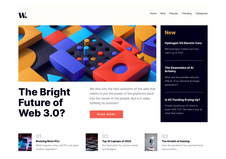
Design comparison
Solution retrospective
This was my first big page. It was hard for me to arrange the elements on the page. I was able to use flexbox properties for this. This is the first time I've created a hamburger menu. When you click the menu, it appears or disappears. Please give me feedback on what I can do better :)
Community feedback
- @mattzavadaPosted over 2 years ago
Nice job laying out the elements using flexbox. Another option would be to use CSS Grid handle the larger layout and then flexbox for the smaller area.
One small suggestion: Try adding object-fit to the image tag.
.popular__article>img{
width: 30%;
margin-right: 3vh;
object-fit: cover;
This will keep the ratio consistent as the viewport gets smaller before the break point is reached.
1@exploremPosted over 2 years agoHi @mattzavada! Thanks for your feedback. I will try to use CSS Grid in my next project. I'll fix the photos too. Unfortunately, I didn't put a container on
<img>, that's why they behave so strangely..0
Please log in to post a comment
Log in with GitHubJoin our Discord community
Join thousands of Frontend Mentor community members taking the challenges, sharing resources, helping each other, and chatting about all things front-end!
Join our Discord
