Not Found
Not Found
Not Found
Not Found
Not Found
Not Found
Not Found
Not Found
Not Found
Not Found
Not Found
Not Found
Not Found
Not Found
Not Found
Not Found
Not Found
Your session has expired please log in again.

Submitted

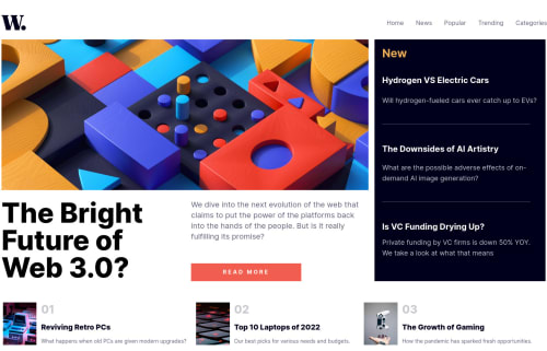
Responsive News Homepage using TailwindCSS.

Booβ€’ 110

@TryinghardFE

Desktop design screenshot for the News homepage coding challenge

This is a solution for...

  • HTML
  • CSS
  • JS
2junior
View challenge

Design comparison


SolutionDesign

Solution retrospective


Hello! This is my first time using the TailwindCSS framework fully. Added a custom animation on the hamburger menu (mobile) & slightly copy pasted a few things on Javascript since I have little to no knowledge of this language yet. All feedbacks will be highly appreciated. To be honest I badly need feedbacks so that I can further improve my skills. Thank you everyone!

Community feedback

Abdul Khaliq πŸš€β€’ 72,660

@0xabdulkhaliq

Posted

Hello there πŸ‘‹. Congratulations on successfully completing the challenge! πŸŽ‰

  • I have other recommendations regarding your code that I believe will be of great interest to you.

HTML 🏷️:

  • This solution generates accessibility error reports, "All page content should be contained by landmarks" is due to non-semantic markup, which lack landmark for a webpage
  • So fix it by replacing the <div class="whole-page-container"> element with the semantic element <main> in your index.html file to improve accessibility and organization of your page.
  • What is meant by landmark ?, They used to define major sections of your page instead of relying on generic elements like <div> or <span>
  • They convey the structure of your page. For example, the <main> element should include all content directly related to the page's main idea, so there should only be one per page

.

I hope you find this helpful πŸ˜„ Above all, the solution you submitted is great !

Happy coding!

Marked as helpful

1

Booβ€’ 110

@TryinghardFE

Posted

@0xAbdulKhalid Thank you so much. Really appreciate it! =)

0
Ayobami Ikuewumiβ€’ 850

@Ikuewumi

Posted

Hi πŸ‘‹. Really nice solution. The only thing I have to say is:

  • I noticed that you placed a max-height on the blog components. This works well for desktop sites, but on smaller devices, it causes some overflow, so you could put the max-height in a media query like md:max-h-28. And generally, unless you are specific about it, I would be wary of setting heights or max-heights. min-heights tend to break less.

Feel free to ask any questions

Keep codingπŸ‘, Ayobami

Marked as helpful

0

Booβ€’ 110

@TryinghardFE

Posted

@Ikuewumi Thank you so much. Really appreciate it! =)

0

Please log in to post a comment

Log in with GitHub
Discord logo

Join our Discord community

Join thousands of Frontend Mentor community members taking the challenges, sharing resources, helping each other, and chatting about all things front-end!

Join our Discord