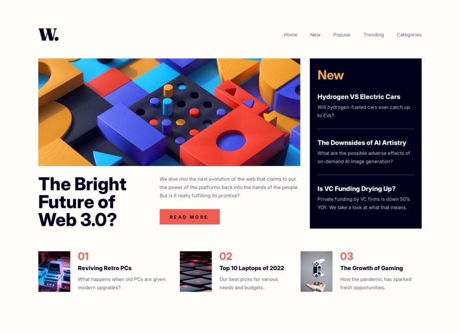
Responsive News Homepage using React.js and Tailwind CSS
Design comparison
Solution retrospective
React, Tailwind CSS, mobile-first approach
What challenges did you encounter, and how did you overcome them?none.
What specific areas of your project would you like help with?Any feedback is welcome!
Community feedback
- P@NikitaVologdinPosted 5 months ago
Hi @roidzuh! Nice job. Layout looks top-notch! A few details to mention: – No hover for the menu-items – No hover for the read-more button – No "cursor: pointer" on clickable elements – Can't click read-more button because it is covered by the menu with the opacity: 0. But it is still present on the layout. – Accessibility could be better. Impossible to open the menu without a trackpad or a mouse. Assistive technologies would not understand that the hamburger menu is the button which opens navigation and is clickable.
Best, Nikita.
0
Please log in to post a comment
Log in with GitHubJoin our Discord community
Join thousands of Frontend Mentor community members taking the challenges, sharing resources, helping each other, and chatting about all things front-end!
Join our Discord
