Submitted over 1 year ago
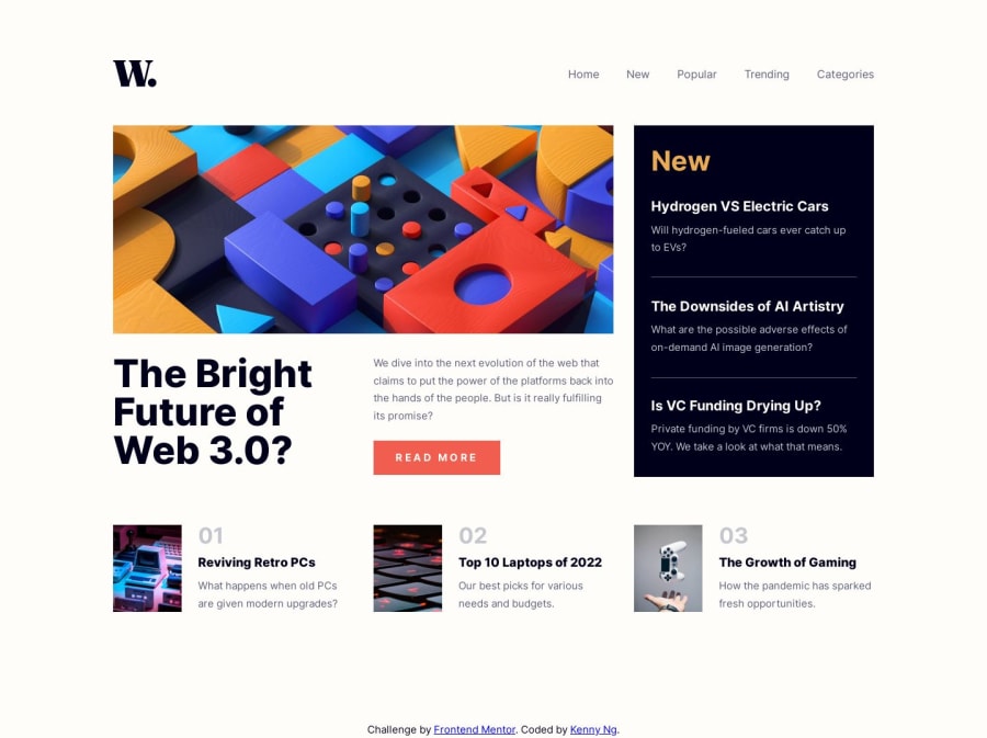
🔥🔥🔥 Responsive news homepage using React
#react#cube-css
@kennylun123
Design comparison
SolutionDesign
Solution retrospective
This is my first exercise using React. I tried to keep elements tidy and separated into tiny components. I would love to hear any comment on my page or coding. Thanks for your help.
What I learned:
- CSS Grid and Flexbox. Use
grid-template-column: 1fr 1fr 1frto keep columns or rows in same ratio. - Responsive image using
<picture>to switch imgage source. - Use the silbling selector (~) to link up the active state of navigation button and the following classes. (When a nav button is activated, the related CSS should be followed)
.nav-menu.active {
transform: translateX(0);
transition: all 200ms ease-in-out;
}

.nav-menu.active ~ .background {
width: 100%;
opacity: 0.5;
}
Community feedback
Please log in to post a comment
Log in with GitHubJoin our Discord community
Join thousands of Frontend Mentor community members taking the challenges, sharing resources, helping each other, and chatting about all things front-end!
Join our Discord
