

Design comparison
SolutionDesign

Community feedback
- @VCaramesPosted over 1 year ago
Hey there! 👋 Here are some recommendations for enhancing your code:
- This
<div class="wrapper">is not necessary ❌.
- Do not ❌ do this
<div class="shadow"></div>to create an overlay. Instead use apseudoelement to crest it.
- The logo’s
alt tagdescription needs to be improved upon ⚠️; it should ALWAYS and only state the company’s name.
- The logo should be outside ⚠️ the
nav.
- The
navtoggle button should be built ⚠️ using abuttonelement and it should have anaria-label,aria-expandedandaria-control.
- This two are not necessary ❌:
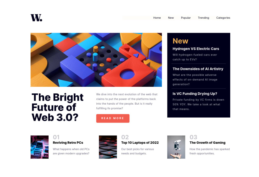
<div class="main-container"> <div class="main-info">- The main article (The Bright Future of Web 3.0) should be wrapped ⚠️ inside an
articleelement instead if asection.
- The "The Bright Future of Web 3.0?" Is not an
h1heading ❌, it is another article heading. It should be anh2heading ✅ and there should be a visibly hiddenh1in the site.
- The main article requires the use of two illustrations 🎑 at different breakpoints ⚠️. The
pictureelement will facilitate this.
Here is how it looks like implemented: EXAMPLE
Syntax:
  <picture>
    <source media="(min-width: )" srcset="">
    <img src="" alt="">
  </picture>
More Info:📚
https://www.w3schools.com/html/html_images_picture.asp
- This
<div class="tech-article">is not needed ❌.
- The "new" section should be built using an
unordered listelement ⚠️ and have anaria-label.
- The bottom section should be built ⚠️ using an
ordered listand have a visually hiddenh2heading.
- Numbers are never ❌ headings.
- The elements that are meant to be interactive are not⚠️. I suggest looking at the "active-states" design file to see which elements are meant to be interactive so that they can be built using the
anchorelement.
More Info:📚
- For improved accessibility 📈 for your content, it is best practice ✅ to use
remfor yourfont-sizeand other property values. Whileemis best formedia-queries. Using these units gives users the ability to scale elements up and down, relative to a set value.
If you have any questions or need further clarification, feel free to reach out to me.
Happy Coding! 👾
Marked as helpful2@JCrotzerPosted over 1 year ago@vcarames Thank you so much! I appreciate the feedback. Always looking to improve.
0 - This

Please log in to post a comment
Log in with GitHubJoin our Discord community
Join thousands of Frontend Mentor community members taking the challenges, sharing resources, helping each other, and chatting about all things front-end!
Join our Discord