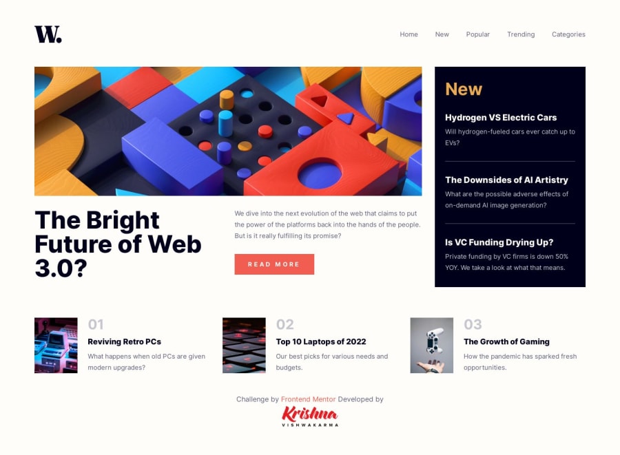
Responsive News Homepage Using CSS Grids & Flexboxes
Design comparison
Solution retrospective
Hi, Mentors
Amazing challenge responsive solution using CSS Grids & Flexboxes with the mobile menu.
What users can do
- View the optimal layout for the interface depending on their device's screen size
- See hover and focus states for all interactive elements on the page
Built with
- Semantic HTML5 markup
- CSS Flexbox
- CSS Grid
- Mobile-first workflow
All the comments are most welcome. Let me know what I can improve more. Thanks!
Happy Mentoring
Community feedback
- @DouooPosted about 1 year ago
Hi Krishna, Seems like you are crushing the challenges 💪🏽. The way you used animation, the structure of your content, and responsiveness are all praiseworthy but I faced an issue while testing your website on a mobile device. The navigation menu was not showing up when I clicked on the hamburger menu. Other than this, I say it is awesome 😊. Keep up the good work 👍🏽
Marked as helpful1P@KrishnaVishwakarma1595Posted about 1 year agoHi @Douoo
Thanks for pointing out this issue. I didn't know. Actually, I forgot to test again after adding the animation classes. It was causing the menu CSS overide. I fixed that. Thanks again!
Happy Mentoring
0
Please log in to post a comment
Log in with GitHubJoin our Discord community
Join thousands of Frontend Mentor community members taking the challenges, sharing resources, helping each other, and chatting about all things front-end!
Join our Discord
