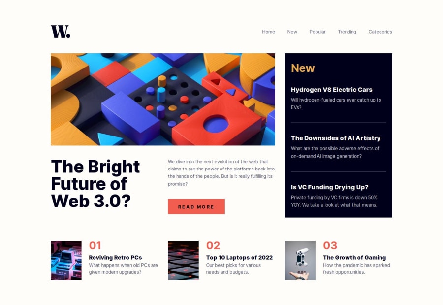
Design comparison
Solution retrospective
I am proud of how I implemented the dynamic image rendering using the NextJS Image component. I wanted to lean on NextJS image optimization. This is the piece of code to get rid of the warnings and make the image file source dynamic:
Hope this helps.
I also used shadcn for the mobile menu. This saved time and helped me focus on the grid layout. The reason I chose this challenge is I wanted to improve my skills in using Tailwind's grid utilities and implementation.
I just eyeballed the layout since I didn't have the .fig file. I focused on learning NextJS, and React, and did my best to make the design close to the mockups.
What specific areas of your project would you like help with?I am fine for now. Enjoying these challenges and learning so much. Thank you.
Community feedback
Please log in to post a comment
Log in with GitHubJoin our Discord community
Join thousands of Frontend Mentor community members taking the challenges, sharing resources, helping each other, and chatting about all things front-end!
Join our Discord
