

Design comparison
SolutionDesign

Solution retrospective
What are you most proud of, and what would you do differently next time?
Using animation for the hidden side navigation.
What challenges did you encounter, and how did you overcome them?Making a side nav bar and making it display differently on bigger screens
What specific areas of your project would you like help with?Thorough improvement in app accessibility
Please log in to post a comment
Log in with GitHubCommunity feedback
- @grace-snow
Here's what I noticed...
- All the content after the header should be inside main. That news section is not "complimentary", it is core page content, so it shouldn't be an aside.
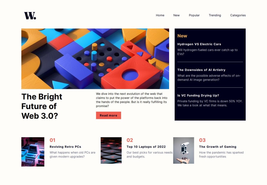
- The heading structure isn't right in this. It's saying "The bright future..." is the page title, then there is a section called "New" and then there are meaningless headings of "01", "02" and "03". This doesn't make any sense at all. Think through the meaning of the page. This is definitely a design that needs some visually-hidden headings to give it structure. For example, h1 - Tech News; h2 - Featured post; h3 - The bright future...; h2 - New; h3 - Hydroden vs...; The article titles should all be headings with links inside as they are headings for the paragraphs underneath them about the article. I've written a post recently about headings which may be beneficial: https://fedmentor.dev/posts/heading-order/
- I can see you've given aria-labels to the various parts of the page but I don't think this is that beneficial in this design. Headings would be much more useful.
- Th bottom section of popular posts looks like a numbered list in the design so that's what I'd expect in HTML.
- Use the picture element for responsive images, not hiding and showing multiple img elements. Doing what you are doing now is terrible for performance, forcing users to download all images no matter what device they are using.
- Is the first image alt a meaningful description? Should that be decorative? If it was to have a description it would be something like "abstract image of colourful wooden puzzle blocks in a complex arrangement".
- The logo must be in the html.
- The home logo link must have an accessible name. e.g. "World News - Homepage".
- A button to toggle the navigation should ideally be the first element inside the
navelement. This way when someone using assistive technology uses a shortcut to jump to the nav, they reach the right control. - I would label the open nav button with the word "menu" or "navigation" at the start so they are intuitive for voice control users. If someone said "click navigation" it should open that nav list, but currently they would have to say "click open" or "click open navigation" for it to work.
- Usually overlays are done with a pseudo element on the body. As a general rule always try to avoid adding empty elements in HTML.
- Personally I would treat this mobile navigation design as a dialog: i.e. I'd use the HTML dialog element for it and give the open nav button an
aria-haspopup="dialog". This would handle all focus and accessibility for you. What you have at the moment is failing because it's trying to follow a disclosure pattern but hasn't used aria-expanded on the open nav button and doesn't close the nav automatically when focus or clicks/taps happen outside of it. - The nav breaks badly if users have a larger text size and view on small screens / on landscape because it's not possible to scroll within it. Make sure there is an overflow-y auto on that nav dialog. You could disable scrolling on the body on mobile when the nav is open if you like.
- Never use pixels for line height. When users change their text size everything becomes very hard to read because text is all squiched up. Line height is usually unitless like 1.5.
Marked as helpful

Join our Discord community
Join thousands of Frontend Mentor community members taking the challenges, sharing resources, helping each other, and chatting about all things front-end!
Join our Discord