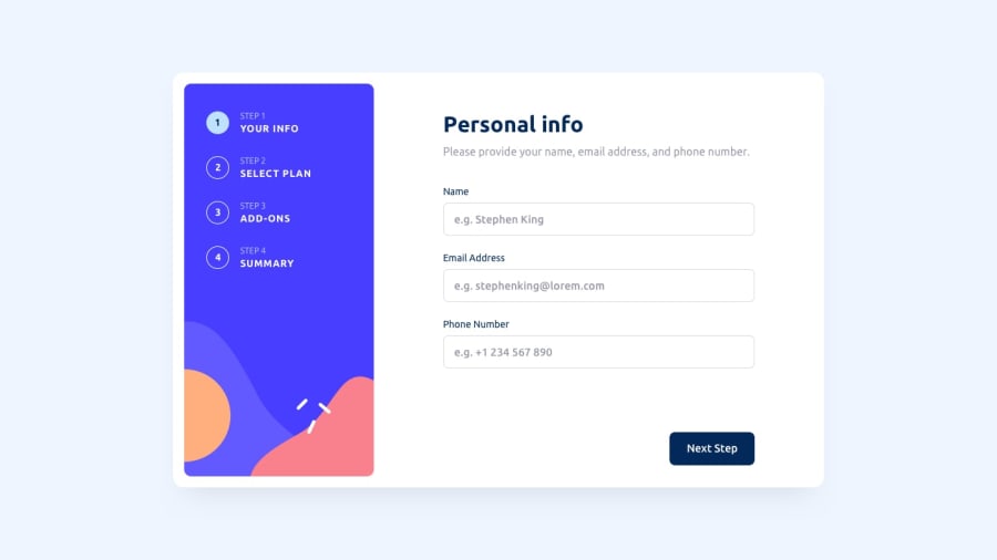
Design comparison
Solution retrospective
Took me a while to complete, I did all the design first and then worked on the calculations for the total afterwards in hindsight I should have done it the other way round.
I used tailwind as it makes writing CSS much quicker but as a result my code looks pretty messy.
I still need to work on the total calculations because currently if the user changes add ons the total doesn't go back down.
Community feedback
- @AhmadYousif89Posted almost 2 years ago
Hi there, just to add to @Ruben's comment, I noticed that if you reached to step 3 (addons) then went back to step 1 then went back again to step 3 you will see that both step 2 and 3 gets selected and rendered to the screen (I guess the nav buttons for the steps have the same id or so). similar thing happens with step 4 but in this case to doesn't trigger the step on first click but rather on the second attempt! and you might need to take a look at the generated report for the accessibility and html validation errors
Marked as helpful1@lgorvinPosted almost 2 years ago@AhmadYousif89 Hi Ahmad, thanks for the feedback. I've now made the adjustments to the nav buttons to fix the problems you were having. I've also had a look at the generated report and managed to remove all the accessibility issues.
1@AhmadYousif89Posted almost 2 years ago@lgorvin that's awesome 👍, btw I hate that popup that tells me to uncheck my previous selection (plan step) it's very annoying 😂
and consider making the change button on the summary step actually change the billing cycle because that's what it's really should be doing not as it's currently functioning (as I have seen on a lot of other projects 😐)
Marked as helpful1@lgorvinPosted almost 2 years ago@AhmadYousif89 Thanks again for the added feedback, completely agree that the popup was very annoying and now it's gone, you can easily switch between the plans now.
The change button has changed also so its changes to yearly or monthly and updates the prices all on the same page.
0@AhmadYousif89Posted almost 2 years ago@lgorvin
Hey man awesome changes, but you still have a couple of issues I'm afraid 😐
-
the total amount is not reflecting the correct amount on change so if I clicked on the change btn it does change the billing but the total amount stay the same.
-
the add-on value gets added to the total every time I go back and forth between step 3 and 4 (I recon that you use the next btn to dispatch the previous action like adding the add-ons to the state)
-
consider adding a label indicating the billing cycle beside the total amount like ($180/Yr) or ($18/Mo)
-
the add-on "custom profile" on monthly billing says $1 where it should be $2 (it gets added correctly as $2 tho)
General considerations
- I took a look at you code and IMO it's too much for a some what simple form logic
- you don't really need any external library to handle the form logic IMO just a simple useContext would do the trick for you 😉
- if you need to get an idea of how that would work you can take a look at my solution and see if it fits your own logic
Happy coding 👍
0 -
- @RubenSmnPosted almost 2 years ago
Hi Luca, great work on this multi step form! I was impressed by the animation on the check icon! I did find some things that could be improved.
UI/UX improvements:
- changing the plan to yearly does not auto adjust the height of the cards
- switch button does not have a pointer as a cursor
- the Go Back and Next Step buttons do not have a hover effect
State/JS improvements:
- there is no plan pre-selected
- when selecting a yearly plan the add-on prices don't update
- when you select a plan and deselect it on the Finish screen there is no plan only the
(Monthly)text. But the total price still has the previously selected plan price.
I hope you find this helpful, happy hacking!
Marked as helpful1@lgorvinPosted almost 2 years ago@RubenSmn Hi Ruben, thanks for the feedback. I've now implemented all the improvements you suggested. I'm not 100% happy with how I did the auto adjust for the cards as now the next step button moves. I think I'll look at changing this.
1@RubenSmnPosted almost 2 years ago@lgorvin Hi Luca, this has much improved, great job!
For the layout I would suggest you use flexbox. Think of the step indicator as column 1 and the form as column 2. Then in the form you can have your inputs and then you can apply a
justify-content: space-betweenwhich makes the Next Step button always positioned at the bottom.0
Please log in to post a comment
Log in with GitHubJoin our Discord community
Join thousands of Frontend Mentor community members taking the challenges, sharing resources, helping each other, and chatting about all things front-end!
Join our Discord
