Responsive Multi-Page Website with Grid and Flexbox
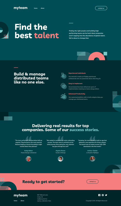
Design comparison
Solution retrospective
Hello Everyone! π
This is my 30th solution on Frontend Mentor! Also, it's my first Advanced challenge. This was a large project and fun project. I learned a lot of new things. π
I learned how to create an accessible hamburger menu. It required me to use an inert
attribute. inert
is an HTML attribute that prevents users from interacting with the interactive elements. Currently, it has 82.97% support by the time I finish this challenge. But, I still need to use a polyfill for browsers that don't support inert
attribute.
Progressive enhancement was also something that I apply when I did the challenge. Usually, when the users disable JavaScript, I will hide all the page content and tell them to turn on JavaScript. Now, I make it possible to interact with the site content without JavaScript. π
Now for the questions:
- Is the menu accessible with your screen reader? I have checked it with Narrator and TalkBack. It seems like everything is fine. But, I am not sure so I recommend trying it yourself with your screen reader.
- I tested the form on the contact page with TalkBack. It turned out that TalkBack pronounce the
input
by reading the label and the placeholder of the input. For example, TalkBack pronounces theinput
name as "Edit box, name, name.". Narrator only read the label of the input (expected behavior). So, is that okay?
This is a large project. I might miss something or do things in bad practice. So, if you notice something wrong or there are things that I could have done better, please do let me know. π
Also, if you have finished this challenge and would like me to give feedback on it, please include a link to your solution. I would be glad to help you! π
Thanks!
P.S. I wrote everything that I learned on the README.md
. You should check it out to see some of my approaches to solving the tricky parts of the challenge. π
Community feedback
- @VCaramesPosted about 2 years ago
Hey @vanzasetia! "Great looking site!
I used my mac's "Voice Over" and "Tab" button to navigate you site and I had no issues at all. I was able to navigate from the header all the way down to the footer and I was able to open all the buttons.
Why use Divs for the "sections" instead of the Section Elements?
The only thing I would improve is wrapping the address and phone number in Anchor Tags and set their Href in this manner so users can click on them and the phone/address app can open automatically:
Phone:
<a href="tel:+1-543-123-4567">Phone: +1-543-123-4567</a>
For the address you can use any map you prefer, I used Google Maps for the example.
Address:
<a href="http://maps.google.com/?q=987 Hillcrest Lane Irvine, California 92714 ">987 Hillcrest Lane Irvine, California 92714</a>
For the social media icons I would give them a
target="_blank" rel="noopener noreferrer"
so they can open on a new tab. Making it easier for the user to go back to you site.Happy Coding! π»π
Marked as helpful0@vanzasetiaPosted about 2 years agoHello, @vcarames! π
Thank you for the feedback! Also, thank you for checking my site with VoiceOver! I am glad to know that you found no issues. π
I use
div
instead ofsection
because it's the same. Whether I usesection
ordiv
, it has no impact on the accessibility of the site. It won't cause issues or make it more accessible.For the phone number, I decided to not wrap it in an anchor tag. It's not part of the interactive element based on the design.
For the address, I didn't know about using Google Maps. Thank you for telling me this! π
For the social media links, I might do that if it is a real website. I think it's better to not have any links that open in a new tab unless the users will lose data. So, a good example is when the users are required to open another webpage while filling out a form.
You can read "G200: Opening new windows and tabs from a link only when necessary | Techniques for WCAG 2.0".
Users can choose to open the link in a new tab if they want to by right-clicking the mouse and then choosing "Open link in new tab" (in Chromium browsers). Or hover over the link, press the
Ctrl
key, and click the link. That will also do the same thing.Happy coding too! π
1@VCaramesPosted about 2 years ago@vanzasetia
The article you provide was very beneficial! Did not know that. Thank you!
2@EngineerHamzieyPosted about 2 years ago@vanzasetia thanks for providing us with an informative readme π Kindly help me to checkout my solution here π when you have time. Thanks in advance.
0@vanzasetiaPosted about 2 years ago@EngineerHamziey
I have provided some feedback. Hope my feedback helps! π
1@EngineerHamzieyPosted about 2 years ago@vanzasetia yes thanks alot π I'll follow up soon, I have been busy at work π
1 - @krutagna10Posted about 2 years ago
@vanzasetia I have one question, if you are using scss then why are you not nesting the selectors ?
0@vanzasetiaPosted about 2 years ago@krutagna10
Hi again, Krutagna! That's a good question! π
I don't do selector nesting because it makes it harder for my future self to understand the code. It is much easier to understand if the code has fewer symbols.
For example, let's take a look at this first code snippet.
.button { /* some styling */ &--border-white { /* some styling */ &:hover { /* some styling */ } } }
Now, the second code snippet.
.button { /* some styling */ } .button--border-white { /* some styling */ } .button--border-white:hover { /* some styling */ }
Both code snippets are doing the same thing. But, it is much easier to understand the second code snippet because it does what it says. There's no need to think something like "what is the parent selector for this selector?". Also, more developers can understand the second code snippet because it's the same as the CSS syntax.
I can apply the same logic (having fewer symbols) when writing JavaScript.
if (true) { return true; } else { return false; } // compare it with true ? true : false;
The first one is much easier to understand than the second one. The second is much shorter but it is not human-readable.
1@krutagna10Posted about 2 years ago@vanzasetia That is a great explanation. Thank You !
1@krutagna10Posted about 2 years ago@vanzasetia Can you give me feedback to my solution here
Originally I used CSS for styling, but I changed it to SCSS and used BEM for naming items.
0@vanzasetiaPosted about 2 years ago@krutagna10
Sorry, I can't give feedback on the solution for the Designo challenge. I am currently doing that challenge. So, if I am taking a look at your solution, that means I am cheating. π
I can only suggest you read "5 Handy Sass Code Snippets" article. In that article, you may find some useful
@mixin
to help you write Sass.Anyway, I want to say congratulations on completing that Guru challenge! π It's amazing that you are able to complete such a large project. π
1@krutagna10Posted about 2 years ago@vanzasetia No problem, I will go through the article.
As for completing the project, it took me so many days to complete it , and and I found errors each time I went through the codeπ.
Anyways, I think it is a great projectπ₯, as I learned so many things while building it.
0@vanzasetiaPosted about 2 years ago@krutagna10
I am also guessing that it will take me more than one month to finish the challenge. π
Yeah, I hope that I'll learn a lot of interesting things after I complete the challenge. π
Anyway, thank you for your understanding! π
0
Please log in to post a comment
Log in with GitHubJoin our Discord community
Join thousands of Frontend Mentor community members taking the challenges, sharing resources, helping each other, and chatting about all things front-end!
Join our Discord