Submitted 7 months ago
Responsive Multi Step Form (React/Typescript)
#react#recoil#typescript#styled-components

@aberllin

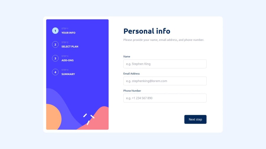
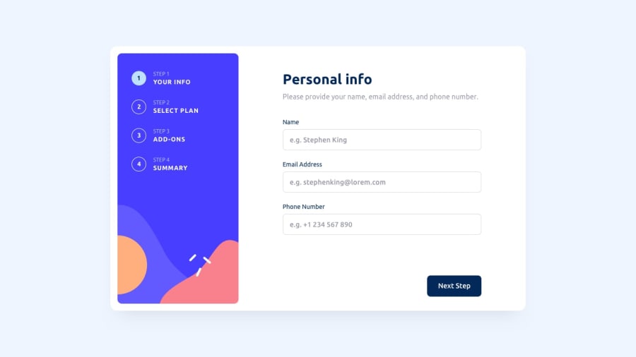
Design comparison
SolutionDesign
Solution retrospective
What are you most proud of, and what would you do differently next time?
Most proud of:
-
Responsive Design: I'm really proud of how the design adapts seamlessly between desktop and mobile. It looks professional and user-friendly on all devices.
-
Component Structure: The use of atomic design principles to break down the UI into reusable components made the code more maintainable and scalable.
-
Theming with Styled-Components: Implementing a global theme made it easier to manage colors and sizes consistently across the application.
What I will do differently next time:
- Initial Setup: Instead of setting up Webpack from scratch, I might start with Create React App or another boilerplate to save time on initial configuration. (As I eventually did.)
- Testing: I would integrate more comprehensive testing (unit tests with Jest and integration tests with React Testing Library) from the beginning to ensure the application is more reliable.
- Accessibility: I would focus more on accessibility features to ensure the application is usable by everyone, including keyboard navigation and screen reader support.
- TypeScript Integration: Adding TypeScript improved the code quality by catching errors early and providing better documentation through types.
Challenges Encountered:
- Webpack Configuration: Setting up Webpack and configuring it correctly for a custom React setup was challenging and time-consuming. (Eventually used create-react-app).
- Static Assets Management: Ensuring that images and fonts were correctly referenced and loaded, especially when dealing with different environments and build processes.
- Responsive Design: Making sure the design looked good on all screen sizes required careful consideration and testing.
- State Management in Forms: Managing state across multiple steps of the form and ensuring data was passed correctly between steps was a bit tricky.
How I Overcame Them:
- Learning and Documentation: I spent a good amount of time reading documentation and various tutorials to understand the configuration better.
- Using Create React App: For the final version, I switched to using Create React App which simplified the setup process and handled a lot of the configuration automatically.
- Media Queries and Flexbox: For responsive design, I relied heavily on CSS Flexbox and media queries within styled-components to ensure the layout adjusted properly.
- Breaking Down the Problem: For managing state, I broke down the problem into smaller pieces, creating reusable form components and using local state in each step before consolidating the data at the end.
- Debugging and Testing: I used browser developer tools extensively for debugging issues with assets and layout. I also tested the application on different devices to ensure it was responsive.
Community feedback
Please log in to post a comment
Log in with GitHub
Join our Discord community
Join thousands of Frontend Mentor community members taking the challenges, sharing resources, helping each other, and chatting about all things front-end!
Join our Discord