Responsive Multi-step-form Made with Html,Css,React,Tailwind
Design comparison
Solution retrospective
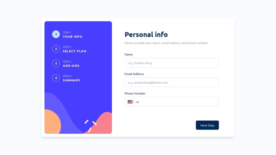
I'm pleased with how I managed React state and smoothly handled it in child components. I implemented error states effectively for phone numbers, names, and emails. By utilizing the react-phone-number-input library, I was able to seamlessly incorporate international calling codes and dynamically display country flags based on the inputted country code.
What specific areas of your project would you like help with?I am here to offer any help I can.
Community feedback
- @Mahmoud-ElagamyPosted 5 months ago
The app is well-built and functions smoothly for the most part. The multi-step form implementation is intuitive, and the layout is clean and easy to follow. I appreciate how each step is clearly delineated, and the user flow is logical.
However, there is one aspect that needs improvement: when interacting with the steps from the sidebar, clicking on a step allows you to proceed to the next step even when required inputs are missing or invalid. This behavior can be confusing, as users might expect to be prompted to fill out any required fields before advancing.
It would be ideal to add validation checks before allowing navigation to the next step. This way, users would be prevented from skipping important fields, improving the overall user experience and ensuring that the form is filled out correctly.
Marked as helpful1@FardindevmPosted 5 months ago@Mahmoud-Elagamy Thank you for checking the website in detail and professionally, and for sending your valuable feedback, Mahmoud Elagamy.
I had actually thought about this part, but the alternative I used is that the user can navigate to the next sections using the left buttons, even if their information is incomplete. However, when they reach the confirmation section, clicking the confirm button does not allow the user to submit the form, and they encounter an error that takes them back to the first section to see both the errors and the empty fields. :)
1@Mahmoud-ElagamyPosted 5 months agoThank you for your thoughtful response and for explaining the current logic behind the validation flow. I understand that users are redirected back to the first section when they reach the confirmation step with incomplete data, and this ensures that errors are addressed.
However, I think the user experience could be enhanced by adding real-time validation when navigating between steps via the sidebar. This way, users would receive immediate feedback and be encouraged to complete the required fields before advancing. This approach could make the form more intuitive and prevent potential frustration from being redirected back at the end.
0@FardindevmPosted 5 months ago@Mahmoud-Elagamy Thank you for the helpful and patient feedback you provide, Mr. Mahmoud Elagamy. I have fixed it; please open the site again and test it. Thank you for sharing your valuable experiences. If you have any other suggestions, I would be happy to hear them.
0@Mahmoud-ElagamyPosted 5 months agoI appreciate your openness to feedback and your quick improvements. The effort you put into refining the user journey really shows. If I come across any further ideas or suggestions, I'll be sure to share them. Keep up the great work—it’s inspiring to see your commitment to delivering a high-quality app!
0 - @Mahmoud-ElagamyPosted 5 months ago
Or what about keeping the current logic and instead of the built in popup message, you create a customized one matching the app's design language for a more user-friendly approach.
2
Please log in to post a comment
Log in with GitHubJoin our Discord community
Join thousands of Frontend Mentor community members taking the challenges, sharing resources, helping each other, and chatting about all things front-end!
Join our Discord
