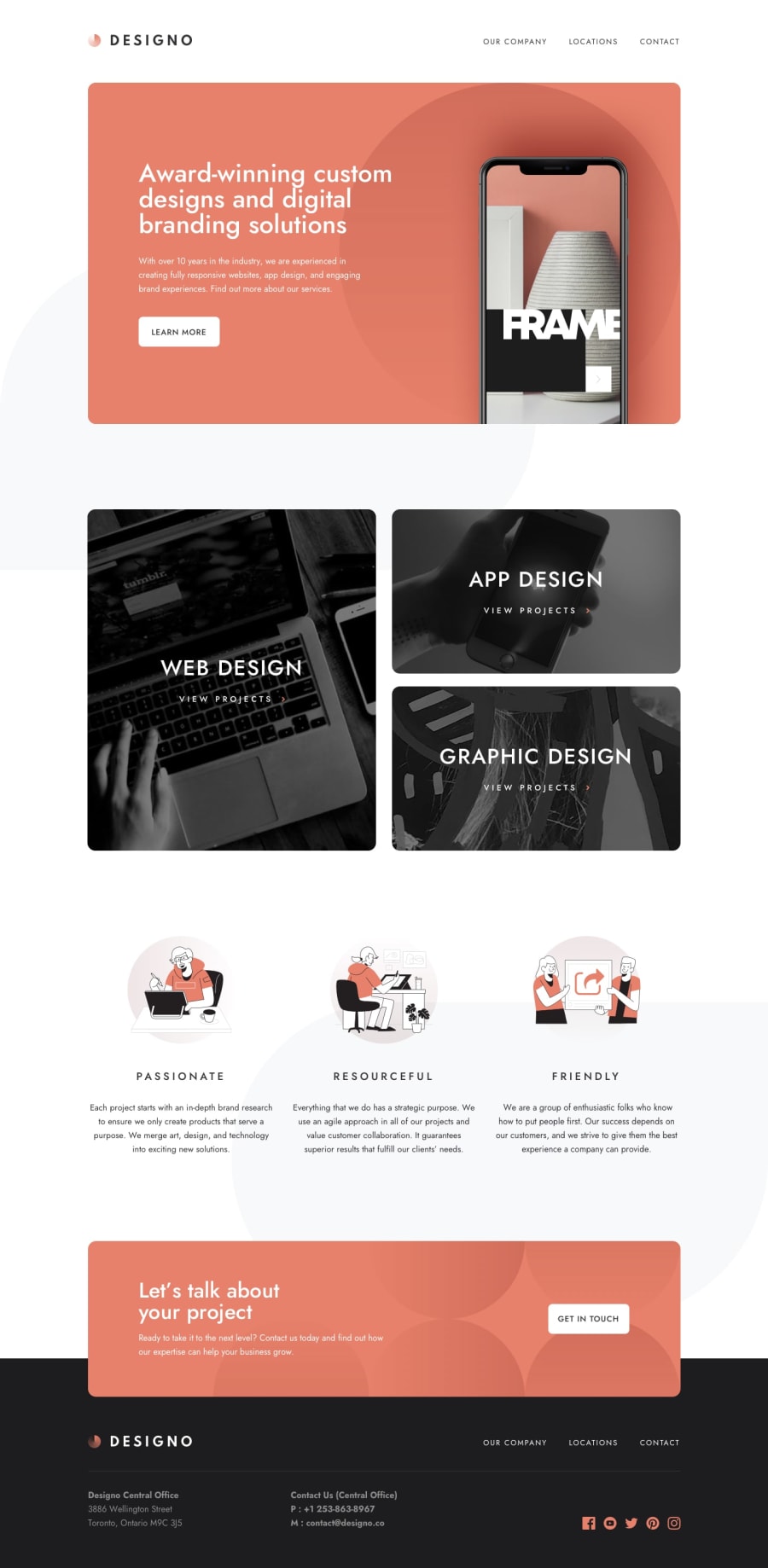
Responsive multi page site using BEM, Less, CSS grid and more
Design comparison
Solution retrospective
-
General feedback is greatly appreciated!
-
This is my first time trying to use BEM naming convention. I like it, but I understand some people do not. If you are one of those people, what do you prefer?
Community feedback
- @vanzasetiaPosted almost 2 years ago
Hi, Kevin!
Every class naming convention has its pros and cons. Block Element Modifier (BEM) uses many classes and can make HTML looks messy.
I use BEM and I find it works well for me. So, if you find BEM works well for you then don't worry about other people's opinions about it.
Now, I have some suggestions to improve this solution. First, for the home page:
- Remove the word "logo" from the alternative text of the logo. Alternative text should not contain any words that are related to "image".
- For images containing text, make sure the alternative text includes the image's text. In this case, the Designo logo should have an
altvalue of “Designo”. Reference — Checklist - The A11Y Project #for-images-containing-text-make-sure-the-alt-description-includes-the-images-text - Setting
visibility: hiddenfor visually hidden styling will remove the element from the accessibility tree. The hamburger menu does not have text content. - The page should only have one
<nav>element for desktop and mobile navigation. Avoid creating duplicate HTML markups for different devices. - "web design", "app design", and "graphic design" are not headings. The same goes for the "view projects". Those are links with heading styling.
- Having
<h2>and<h3>as the children element of<a>is potentially invalid HTML. So, change those headings to<span>. Caninclude - Child<h2>and Parent<a> - All illustrations are decorative images. So, leave the alternative text empty (
alt=""). - For your information, decorative images are images that don't add any information and serve only aesthetic purposes.
- If the logo is wrapped by an anchor tag, include the link destination on the alternative text (
alt="Designo - Home").
After writing those suggestions, I notice there are two HTML files for the home page, one
index.htmlon the root of the repository and another one on the/pages/home/home.html. I am confused.Anyway, here are some more suggestions:
- Avoid using JavaScript to add styling (unless you have no other option). JavaScript allows you to change the CSS code using the
styleproperty. But, to make debugging easier and improve code maintainability, it’s best to avoid it. Use CSS classes instead. - Provide the non-minified CSS, so people can give feedback about the styling of the website.
I hope you find this useful. Happy holidays!
Marked as helpful1@kwalker3000Posted almost 2 years ago@vanzasetia
Hey, Vanza!
Thank you for the feedback! Accessibility is something I would like to improve on so this was very helpful.
Ah, yes. The two home pages are that way because GitHub Pages was not able to access my project. It was meant to be a temporary solution. I will fix that.
Happy holidays
1
Please log in to post a comment
Log in with GitHubJoin our Discord community
Join thousands of Frontend Mentor community members taking the challenges, sharing resources, helping each other, and chatting about all things front-end!
Join our Discord
