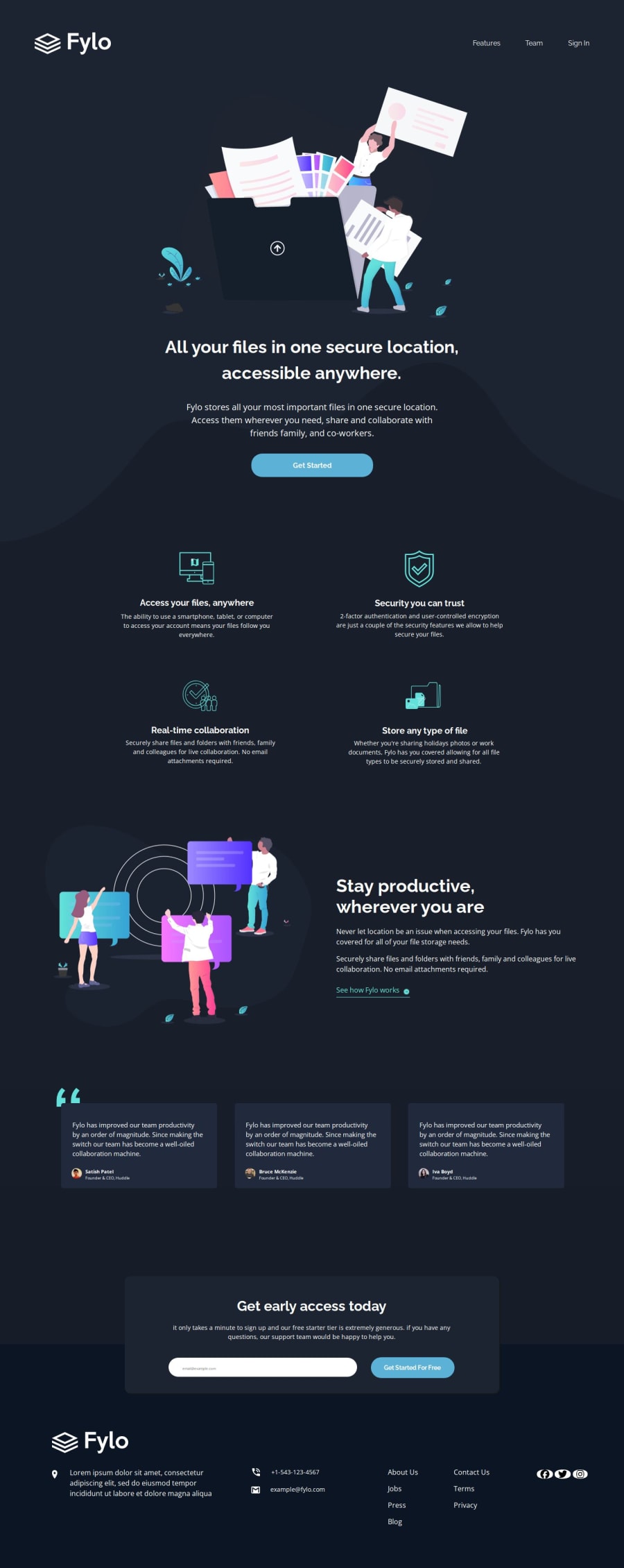
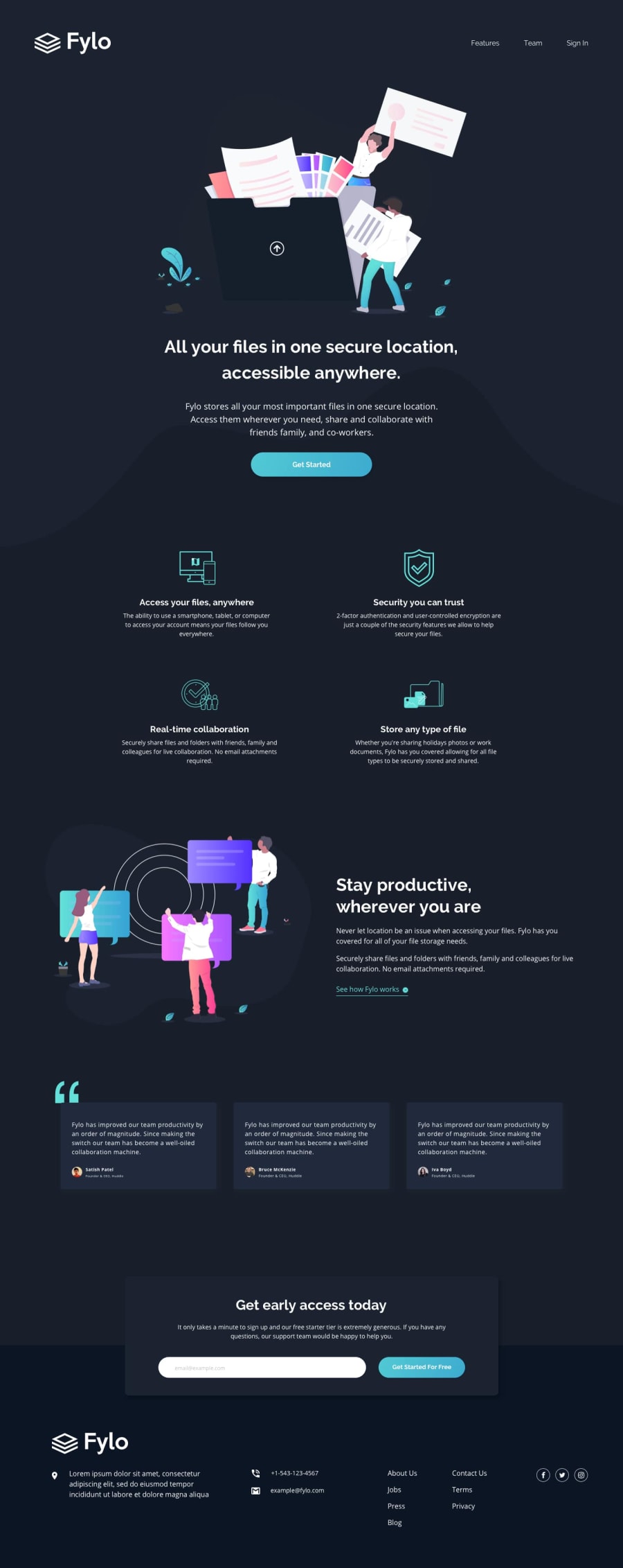
Responsive, movil first, fonts variants, Fylo landing page using BEM


Design comparison
Solution retrospective
- Take care about the differents fonts used in the page, I didn't it and my page fonts didn't match with the design.
- Know when to use flex or grid or both to complete the challenge.
- Yes, this is a good challenge to practice flex-box and grid.
- Using rem instead em, give a good control of the font-size and margin/padding
- Match the design with the page without Figma values for the margins, padding for the differents elements.
- Do the pixel perfect.
- Fonts size for the heading and pharagraps.
- Do I use correct flex and/or grid? why?
- Do I use correct BEM naming?
Community feedback
- @xStephxPosted 6 months ago
Hi @mgallegoa,
I check your solution and I saw that you done landing page to looks great in the given formats (1440px for desktop and 375px for mobile). It perfectly matches the design images, but page doesn’t display well on other screen sizes, such as tablets or larger desktops. You can improve this by using the browser’s inspect element tool to test on different dimensions.
Your CSS is well-organized and neatly structured by components, which makes it easy to maintain and update, also if you are like to do like that organizations you can check SASS it is powerful for that.
Consider using the Font Awesome library for social media icons. It’s a great resource for high-quality, scalable icons that are easy to implement.
To make responsiveness easier, you could try using a framework like Bootstrap or Tailwind CSS. However, once you have a strong understanding of Flexbox and Grid, it will be even easier to customize layouts for all screen sizes without relying on a framework.
I hope it helps you!
Have a nice coding!
Marked as helpful6@mgallegoaPosted 6 months agoThank you @xStephx for your valuable suggestions
1

Please log in to post a comment
Log in with GitHub
Join our Discord community
Join thousands of Frontend Mentor community members taking the challenges, sharing resources, helping each other, and chatting about all things front-end!
Join our Discord