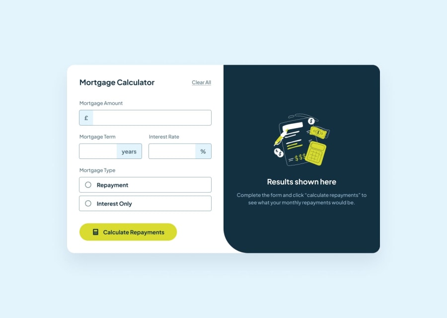
Design comparison
Solution retrospective
That have been able to understand how to make custom radio buttons and also the JS to select them
What challenges did you encounter, and how did you overcome them?The placeholder customizing gave me a lot of hell
What specific areas of your project would you like help with?If anyone could help with the placeholder, I will appreciate it As you can see is a mess
Community feedback
- @Davidnsude951Posted 4 months ago
Bro u did well but work on ur flex box , try using spacebetween , setting a parent div and a width eg width:100%; . aside from that u got potential bro 😁😁😁
0 - @SecretariatVPosted 4 months ago
Hi, @Agyemang99. Nice to meet you.
Your working is good.
But have got some problems.
It's input parts.
Your inputs are mess. Becouse you use only input for this.
If you complete this part you use input and other.
This is my solution. (Of course it's not best solution. Only me)
<div class="input"> <input type="number" name="amount" id="amount"/> </div>.input { border: 1px solid var(--slate-700); border-radius: 6px; position: relative; transition: all ease-in-out .2s; overflow: hidden; cursor: pointer; width: 100%; }
.input::before { position: absolute; height: 100%; top: 0; display: flex; align-items: center; justify-content: center; background-color: var(--slate-100); transition: all ease-in-out .2s; font-size: 16px; font-weight: 700; color: var(--slate-700); }
input { outline: none; border: none; padding: 15px; width: 100%; font-weight: 700; font-size: 16px; }
I hope this helps you.
Thanks.
0
Please log in to post a comment
Log in with GitHubJoin our Discord community
Join thousands of Frontend Mentor community members taking the challenges, sharing resources, helping each other, and chatting about all things front-end!
Join our Discord
