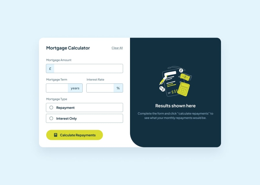
Design comparison
SolutionDesign
Solution retrospective
What are you most proud of, and what would you do differently next time?
- It was easier than I thought to format the amount's input without using a third-party library. But it led to accessibility issues mostly on mobile (the input is no longer of type
number, buttext). Next time I'll probably use a library like Cleave.js so I won't have to deal with all the side effects. - I'm happy I got the opportunity to experiment with Zod for client-side data validation (even if it was probably overkill here, but it made error handling way easier and much more flexible).
- I tried experimenting with CSS grid for mobile responsiveness.
- I struggled so much on changing the color of the radio buttons. It seems that I can't change it directly, since it is browser dependant (?). I had to make it invisible and replace it with 2 divs placed one inside another with absolute positioning, which resulted in slightly different layout with different browsers/screens. Next time I'll probably use an image instead. Any advice is much appreciated.
- I'm still having trouble with the content of my page wrapping along the vertical axis on small width, and overflowing its container (I can't find a way to crop the content when I reduce the width).
- I couldn't expand the background of the result's section to match full remaining height, so it poses an issue on large vertical screens.
Community feedback
Please log in to post a comment
Log in with GitHubJoin our Discord community
Join thousands of Frontend Mentor community members taking the challenges, sharing resources, helping each other, and chatting about all things front-end!
Join our Discord
