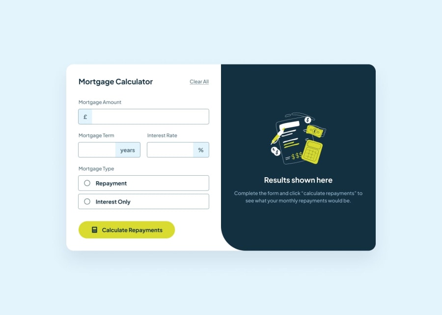
Design comparison
Community feedback
- @OluwalolopePosted about 2 months ago
Great work! However i suggest you add an attribute of " step='0.01' " to the number input field, this will allow the user to input decimal values as well. Also can you make it such that the results only show when the user puts correct values. If I click the submit button without putting correct values, it shows NaN.
Marked as helpful0 - @denizsecmenPosted about 2 months ago
Great job on your work! However, I suggest delving into flexbox for aligning the main element to the center. This approach offers ultimate flexibility in positioning and can enhance the overall layout significantly. It allows for easier adjustments and a more responsive design. Keep it up!
Marked as helpful0
Please log in to post a comment
Log in with GitHubJoin our Discord community
Join thousands of Frontend Mentor community members taking the challenges, sharing resources, helping each other, and chatting about all things front-end!
Join our Discord
