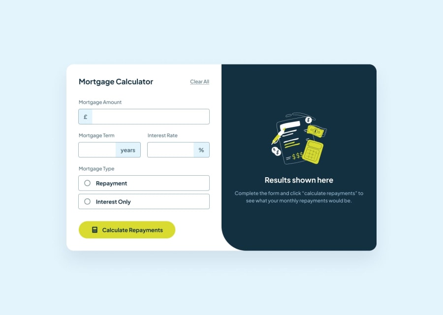
Design comparison
SolutionDesign
Solution retrospective
What are you most proud of, and what would you do differently next time?
I'm proud of using flexbox & grid to achieve the layout
What challenges did you encounter, and how did you overcome them?I had a challenge getting the currency symbols to sit flush inside of the input.
I also had trouble keeping my CSS clean, it could do with a refactor for sure.
Community feedback
Please log in to post a comment
Log in with GitHubJoin our Discord community
Join thousands of Frontend Mentor community members taking the challenges, sharing resources, helping each other, and chatting about all things front-end!
Join our Discord
