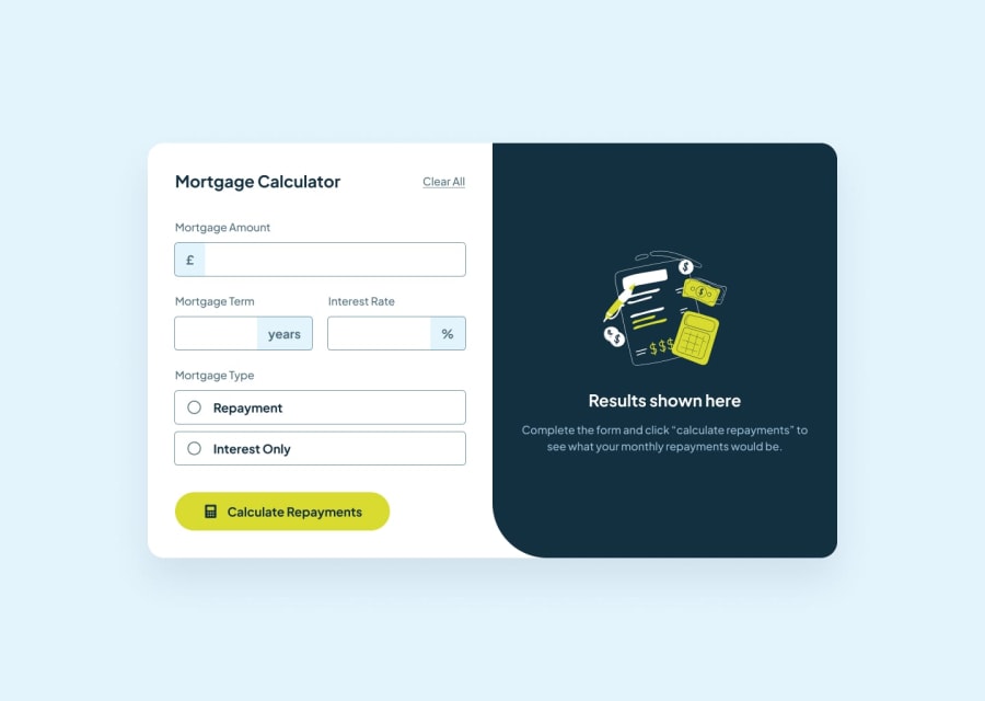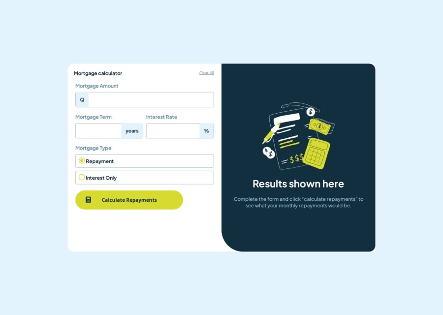
Responsive mortgage calculator using flex and grid, with scss
Design comparison
Solution retrospective
I am proud of how I have been able to make the responsive design very similar to what has been shown to me in the screenshots with my knowledge and research in the documentation, I have made several mistakes and I have wasted time on the same problem for a long time, I have missed things that at the beginning of the web I did not think about in the future, which I will change next time.
What challenges did you encounter, and how did you overcome them?I have had problems organizing the inputs where numbers are entered, and I have solved it by researching the official HTML and CSS documentation. I have also had problems manipulating the DOM, with problems that I had not the slightest idea of how to create the solution from scratch, researching on the internet, on the StackOverflow website I was able to find many solutions that were useful to me, and I have been able to apply these solutions to my problem.
What specific areas of your project would you like help with?In the use of scss I think I have been able to use it in a better way, I would like to know what bad practices I have done in the organization with scss. Also in javascript, I have used pure javascript to practice it, however, I think my solution can be more efficient and shorter.
Community feedback
- @Anubliss-0Posted 3 months ago
Hello, and congrats on finishing this challenge! I have taken a little look at your comments, code and the page itself and have a few tips and feedback to offer 😄
You mention about organizing your SCSS. It seems you already have a good understanding on some of the great features SCSS has to offer, the use of a @mixin for the desktop media query is a nice touch which really helps with cleaning up the code. The use of variables for colours is also good practice for front end development.
A couple of things I will point out in terms of SCSS...
-
Usually it is considered best practice to only nest styles three layers deep when writing SCSS as it can get quite hard to read. To target specific elements you could utilize a mix of SCSS nesting and CSS combinators/selectors.
-
It seems you have access to the figma design file based on your variable naming system. As such I find it is helpful to create typography mixins to use throughout my projects based on the typography styles provided in the design file! This will also help with ensuring the correct font sizes are used in your project.
Your use of Pure JS is undoubtedly good practice, I however would consider looking into some modern JS coding provided by ES6! You have already used consts which is part of that but there is so much more to offer.
In terms of a11y, there is some work that could be done here, but that's a whole chapter of the book on its own. I strongly recommend looking into it I would implement it as part of your next project rather than go back and try to add it to this.
One last thing, I see on your GH that you want to learn React. Its a good idea and a great framework for creating web applications. As you continue down this learning path I would suggest looking into modular styles as it can really help with organizing style rules.
But again, great job! Sorry for the wall of text, please take these as suggestions rather than must-haves and most of all enjoy your future projects!
Please feel free to reach out if you have any questions!
Marked as helpful0 -
Please log in to post a comment
Log in with GitHubJoin our Discord community
Join thousands of Frontend Mentor community members taking the challenges, sharing resources, helping each other, and chatting about all things front-end!
Join our Discord