
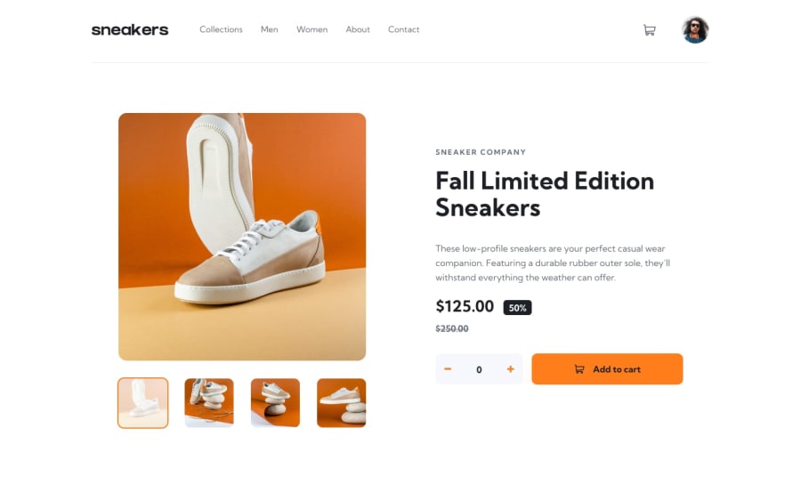
Submitted about 2 years ago
Responsive mobile-first solution using custom CSS and Bootstrap.

@fanifrancs

Design comparison
SolutionDesign
Solution retrospective
What do you think about the navbar and its responsiveness?
Community feedback
- @yosefbrowncodePosted about 2 years ago
Keep up the good work. One of the things I noticed is when you hover over the menu and the orange border bottom shows. the header moves. an easy fix for that is to make a transparent border bottom and just change it on hover.
Keep up the good work
Marked as helpful0@fanifrancsPosted about 2 years ago@yosefbrowncode Thanks very much for the observation. I'm going to work on it ASAP 💯.
0@fanifrancsPosted about 2 years ago@yosefbrowncode Thanks very much for the observation. I'm going to work on it ASAP 💯.
0

Please log in to post a comment
Log in with GitHub
Join our Discord community
Join thousands of Frontend Mentor community members taking the challenges, sharing resources, helping each other, and chatting about all things front-end!
Join our Discord