Responsive Mobile-First social-media-dashboard-with-theme-switcher
Design comparison
Solution retrospective
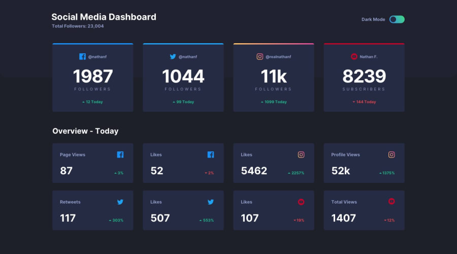
I love grid so I loved this challenge. In the larger screen-size I set grid-template-columns to repeat(auto-fit, minmax(10rem, 1fr)). This means our grid will create columns as it needs to and as it can fit them and each column will be a minimum of 10rem and it will expand until a new item of 10rem has the room to be added.
First I tried using a checkbox for the toggle and modifying it in CSS but it gave me some problems so I just created a custom toggle.
The part that gave me the most grief and I wasted the most time on - was the linear-gradient on the instagram card. I first tried using border-top with border-color but that didn't work. Then I got it to work using border-image and the linear-gradient but I couldn't get the border-radius to work so I had to change my entire code for this part. Eventually, I created another div and placed it position: absolute in front of the card and put the linear-gradient on the back div and using top and padding-top I madde it work. But I REALLY wanted to make it work using border-image so after this challenge I am going to learn more about linear-gradients and -webkit etc. = because anything is possible - isn't it??
I created two entire dashboards: one for light and one for dark. Then I positioned them absolute and toggled them in JS.
With dynamic data it could be a good challenge especially with the followers numbers and likes etc changing. The arrow up and down and the colors to correspond with them would be fun to do in JS.
Community feedback
Please log in to post a comment
Log in with GitHubJoin our Discord community
Join thousands of Frontend Mentor community members taking the challenges, sharing resources, helping each other, and chatting about all things front-end!
Join our Discord
