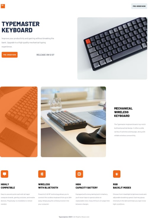
Responsive, mobile-first landing page built using TailwindCSS

Solution retrospective
Thank you for taking the time to check this project out! Overall, it wasn't too hard, and it was great practice in making a clean, responsive website. My biggest challenge was creating the orange overlay for the orange image on the screen. The design shows a dark, deep orange that makes it looks like you are looking through orange tinted glasses at the image. However, I was unable to achieve this design look using Tailwind or custom CSS. I settled on creating an orange background div to place as an overlay. Is there a better way to do this using CSS or do I need to use photoshop? I would love any help or insight on this! Thanks again for checking it out.
Please log in to post a comment
Log in with GitHubCommunity feedback
No feedback yet. Be the first to give feedback on LukaSkudrzik's solution.
Join our Discord community
Join thousands of Frontend Mentor community members taking the challenges, sharing resources, helping each other, and chatting about all things front-end!
Join our Discord