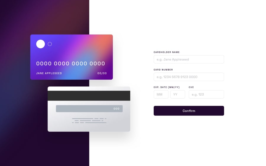
Design comparison
Solution retrospective
Hello everybody, thank you in advance for reviewing my solution! :)
In this challenge, I've struggled quite a bit to design it responsively. More precisely, I did not know how to position the front and the back of the card properly on the screen (tried it using position relative/absolute CSS properties), nor was I able to adapt their sizes responsively.
If anyone could shine a light on it I would really appreciate! ^^ Also, feel free to comment on any other improvements (I know there are a bunch!)
Thanks!
Community feedback
- @0xabdulkhaliqPosted over 1 year ago
Hello there 👋. Congratulations on successfully completing the challenge! 🎉
- I have other recommendations regarding your code that I believe will be of great interest to you.
COMPONENT MEASUREMENTS 📐:
- The
width: 100%property forbody&mainelement is not necessary. because they are block level element which will take the full width of the page by default.
- So feel free to remove
width: 100%style rule from both of the elements, this will help you to write efficient code and makes your code more reusable.
.
I hope you find this helpful 😄 Above all, the solution you submitted is great !
Happy coding!
Marked as helpful0
Please log in to post a comment
Log in with GitHubJoin our Discord community
Join thousands of Frontend Mentor community members taking the challenges, sharing resources, helping each other, and chatting about all things front-end!
Join our Discord
