Responsive Mobile-First - fylo-dark-theme-landing-page
Design comparison
Solution retrospective
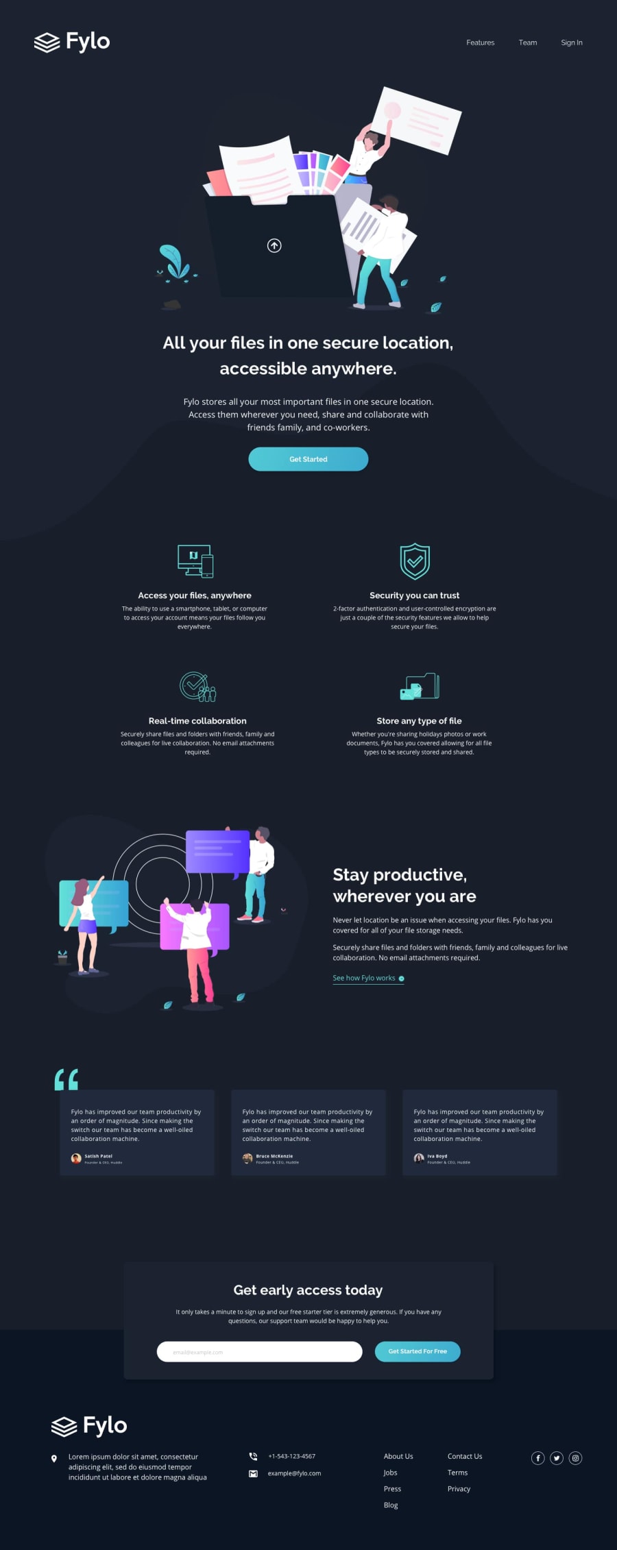
I love using picture - source so that the images automatically change you increase the screen from mobile to desktop. So I used it for the bg- curvy and in order to get it to go behind the intro illustration - I put a margin-bottom of -2.5rem on the intro illustration and positioned it relative so that I could use the z-index which I set at 2 so that we can see the bottom guys tootsies :) Then I had to bust the h1 out of the section so that I would not get the dark background behind it.
While doing the email/input/form bit, I learned and relearned many things. If you set the input type to email you get default error messages and in order to remove them you must set novalidate on the form. I set up the JS so that an error message comes up if the user doesn't input anything or if they input an incorrect email. And I set it so that the errors come up whether the user hits the enter key or the "Get started for Free" button.
When using the font awesome fa i's - the social media's are much easier to change colors than when you use svg's. And interestingly it has taken me this many challenges to realize I should have been changing the colors of ALL of them and not just the twitter one - WAKE UP Barbara!
My media queries are a bit scrappy but I will improve on them in the next challenge.
Community feedback
Please log in to post a comment
Log in with GitHubJoin our Discord community
Join thousands of Frontend Mentor community members taking the challenges, sharing resources, helping each other, and chatting about all things front-end!
Join our Discord
