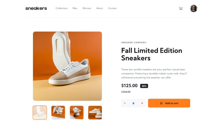
Responsive Mobile-first - ecommerce-product-page-main
Design comparison
Solution retrospective
I feel a wee bit traumatized by this challenge - so I don't know if I can even talk about it :O ...but I will try! and FYI I used to LOVE the color orange - but now? - not so much!
The arrow icons were coming in too large and even when I went into the svg files I couldn't get them to be a reasonable size so I ditched them completely and used ❮ and ❯ instead. They aren't quite as bold but I like them. I did turn them orange when they are clicked on and turned the opposite one grey - so that was a bit of fun!
2 big problems I still have are:
If the user tries to click on a thumbnail a second time to select the Lightbox - it doesn't work - I tried location.reload(). but hate it as it jumps AND it removes anything a user might have in their cart.
Same idea, if a user messes around with add to cart etc. and comes back to it again - if they click the plus button it starts at 2 instead of 1. So to stop this I tried location.reload() again and got the dreaded jump thing AGAIN :(
Overall, I am actually happy with what I WAS able to accomplish.
Community feedback
- @NatureSon22Posted 8 months ago
I noticed that on your website, the width of the body changes at a certain breakpoint due to a max-width setting. This can affect the layout of your elements on different screen sizes. To keep everything organized, I'd recommend using a wrapper <div> as the main container for your website. Here's how you can structure it:
<body>
  <div class="wrapper">
    <!-- the rest of your elements -->
  </div>
</body>
This way, you can manage the layout more effectively!
Marked as helpful0@bward67Posted 8 months ago@NatureSon22 Thank you so much for your feedback. I could use all the help I can get :) - I have been using <main> on most of my projects - but is a <div> better? Thanks again.
0@NatureSon22Posted 8 months ago@bward67, we should build HTML using semantic elements, as it makes websites more accessible, especially for people who use screen readers. Using the <main> tag to wrap content(relevant to the page's primary subject matter) specific to each page, is better than using a generic <div>. This approach improves the structure and accessibility of the site that can help both users and search engines understand the main content
Marked as helpful0@bward67Posted 8 months ago@NatureSon22, Thank so much. I actually did have all 3 overlays outside of the main, which I should not have done.
0
Please log in to post a comment
Log in with GitHubJoin our Discord community
Join thousands of Frontend Mentor community members taking the challenges, sharing resources, helping each other, and chatting about all things front-end!
Join our Discord
