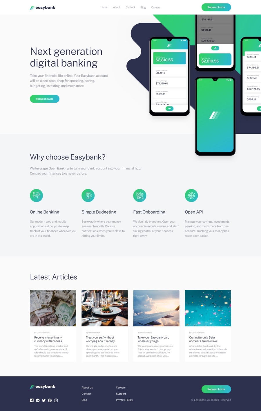
Responsive Mobile-first - easybank-landing-page-master
Design comparison
Solution retrospective
Firstly, I would like to issue a WARNING - my media queries are woeful - please do not look directly at them without protective glasses or you may experience existential sadness! It looks good at 375 and 1440 so my advice would be not to venture on the in-between screen sizes. I think it is because I couldn't get the percentages to work in background-position so I used rem which is causing the issues.
I used a pseudo element for the gradient underline when hovering over the nav-links on desktop size but it took me a while to discover this as I first used a border-bottom but of course I could not get the gradient on it. However, between 568 and 900 the line goes from one side of the screen to the other instead of just under each one - which makes no sense to me so I don't even know where to start to fix it.
A new thing for me was filter: brightness(150%) for the hover on the buttons. I had always used opacity and that was going to dark so I googled how to get it brighter and Voila - it told me about brightness :)
I changed the width of the bg mobile svg for screen sizes 375 to 768px. I think it looks alright but it would look better if I could change the height as well but no matter what number I changed the height to - it stayed the same height. No idea why!
The nav is fixed which is something I think I should always be doing as it does enhance the users experience, doesn't it?
The "Currency" image was a bit taller than the rest so I checked the height of the others which was roughly 221px and then I set them all to that and used object-fit to make sure they kept their aspect ratio.
I couldn't change the colors of the socials using fill: cyan etc. so I copied and pasted all the socials and changed the color in the fill: area and then in JS I did mouseover and mouseout events to create a hover effect. It was a lot of repetitive code but I did it sort of mindlessly while sipping a glass of red wine and watching "the Chase" on TV :)
I used !important - FAR TOO MANY TIMES!! - I can't be trusted with it :)
Community feedback
Please log in to post a comment
Log in with GitHubJoin our Discord community
Join thousands of Frontend Mentor community members taking the challenges, sharing resources, helping each other, and chatting about all things front-end!
Join our Discord
