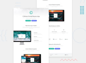
Design comparison
Solution retrospective
I used display grid for the 2 containers under the supercharge your workflow section and I set them as auto-fit with a minmax so that it would be more responsive.
I had to make the 3 images above the logos container the same height because the first one was taller than the rest which meant the h3's and p's would not line up.
I got help for the buttons (and yet there is still some mysterious black curve on the right edges - what is with that?) and the cropped computer image (transform: translateX(-5%)) by watching past of this video: https://www.youtube.com/watch?v=ATRQj60Q3S0 - thank you codewithsadee.
I know I have some scrappy bits in here especially in my media queries but I spent far more time than I thought I would and now I want to move on.
This challenge did not mention JS at all but I LOVE JS and was going through a bit of JS withdrawal so guess what I did? I added some JS but it was also the only way I could figure out how to make the twitter logo turn cyan when you hover over it. I tried fill: cyan but that didn't work. So I created a new svg which I filled with cyan and then I made my parent (.twitter-container) position relative - and I had to give it a height and width - and - full-disclosure - it took me a while to discover that I needed to give it a height and width - but put a border on it and you can figure out most things. Then I made the grey and the new cyan twitter svg position: absolute. Then I did the ole classList.add("hide) and remove("hide) and ("show") with the event listener of mouseover and mouseout - which works just like hover. I LOVE YOU JS - I didn't know that I needed you in my life - but I do - YOU COMPLETE ME! :)
Community feedback
Please log in to post a comment
Log in with GitHubJoin our Discord community
Join thousands of Frontend Mentor community members taking the challenges, sharing resources, helping each other, and chatting about all things front-end!
Join our Discord
