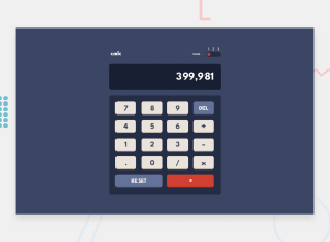
Design comparison
Solution retrospective
What an exhilarating challenge! I was able to do the html and css on my own but I needed to enlist help from Zell Liew for making the calculator work with JS - this is the address: https://www.youtube.com/watch?v=f0SG2j6d-Kg It was so helpful. If I ever decide to pay for a course to learn JS better, I will definitely purchase Zell's. Kevin Powell did the CSS for this and his is obviously excellent, but I had already done mine so I stuck with it - but I watched Kevin's and loved it!
To switch the color themes, I tried to overcomplicate it at first with forEach loops and indexes and transform: translateX() - sort of like I had learnt to do with carousels but in the end I took a much more simple approach and just created 1 circle/dot for each theme and set an event listener on each to make the next one display: block and the last one display: none. Sometimes you have to push yourself away from the keyboard and a solution comes to you. For me it was sitting at Shiv's Bar, with my husband, overlooking the Black Sea in Bulgaria. And ....there MAY have been a glass or 2 of wine involved :)
Community feedback
Please log in to post a comment
Log in with GitHubJoin our Discord community
Join thousands of Frontend Mentor community members taking the challenges, sharing resources, helping each other, and chatting about all things front-end!
Join our Discord
