

Design comparison

Solution retrospective
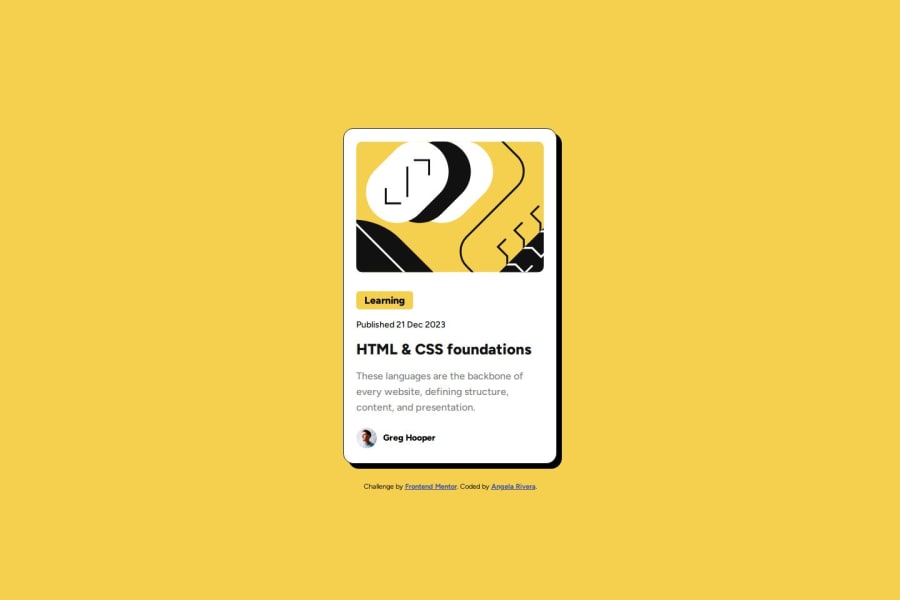
I'm most proud of getting my solution to look as close to the design docs as possible. It took a lot of back and forth, but I think it looks pretty similar.
What challenges did you encounter, and how did you overcome them?I struggled with maintaining the size of the card moving from mobile to desktop. I completely forgot about the max-width property and should have accounted for that in the beginning. I reviewed some of my older projects then added that property. This allowed for the card to not stretch and stayed the same even as the screen got bigger.
What specific areas of your project would you like help with?I would like some tips on the units I should be using. I still get confused with when to use percent, vh/vw, etc. for sizing things on the page. Sizing and positioning objects is usually the hardest thing for me when starting a new project.
Please log in to post a comment
Log in with GitHubCommunity feedback
No feedback yet. Be the first to give feedback on Angela Rivera's solution.
Join our Discord community
Join thousands of Frontend Mentor community members taking the challenges, sharing resources, helping each other, and chatting about all things front-end!
Join our Discord