Design comparison
SolutionDesign
Solution retrospective
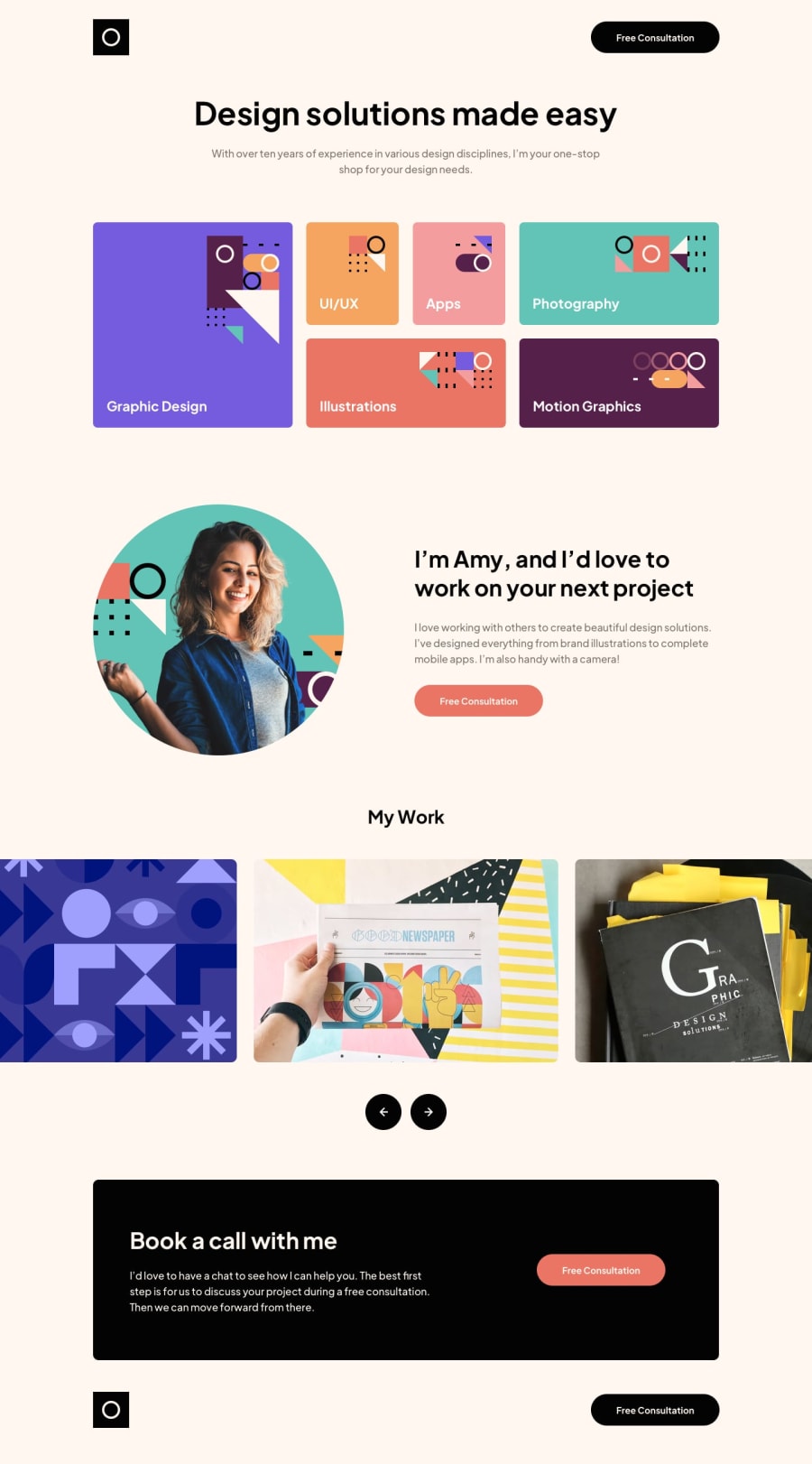
This was a rather complete one! took me some time to finish it. Still, I believe a lot can be improved. I have the feeling I'm abusing too much paddings/margins to find the exact position of the elements. This resulted a rather long CSS code. Also the Desktop CSS has duplicated selectors from the Tablet section, I need to further improve this.
However, I'm quite happy with the result, also is the first time I implemented an image carousel, will explore how to do it infinite!
Feedback is more than welcome, thank you!
Community feedback
Please log in to post a comment
Log in with GitHubJoin our Discord community
Join thousands of Frontend Mentor community members taking the challenges, sharing resources, helping each other, and chatting about all things front-end!
Join our Discord
