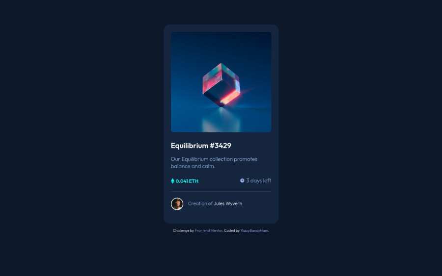
Design comparison
Solution retrospective
Hi!
This is the second project that I did without a tutorial. I would love feedback or advice on how I could have done the hover image effect better. I really struggled with creating the overlay over the main image using Pseudo-elements and gave up in the end.
Thank you in advance for taking the time to look!
Community feedback
- @rsrclabPosted almost 3 years ago
Hi, @yazzybandyham ~
Congratulate on your solution to the challenge on FM platform. I have studied your work carefully and learned a lot from it. Especially I like the image overlay effect on your project.
Here are some of the tips I like to provide.
- On smaller devices, element alignments doesn't look good. Using media query will solve this issue.
- Please try BEM for naming element classes. It will help you a lot on bigger projects.
https://www.frontendmentor.io/solutions/my-first-solution-on-chanllenge-V-4IzAivH
Here is my solution to this challenge, and if it can help you even a bit, it would be happy to me.
Cheers ~
1@yazzybandyhamPosted almost 3 years agoHi @tymren608
Thank you so much for your feedback and advice on improvements I need to make.
I've been struggling with media query, so this will be a useful challenge to gain some understanding of it.
I will also learn BEM as I've never heard of it before and definitely struggling with naming element classes in a more consistent and productive manner.
Thank you again :)
0
Please log in to post a comment
Log in with GitHubJoin our Discord community
Join thousands of Frontend Mentor community members taking the challenges, sharing resources, helping each other, and chatting about all things front-end!
Join our Discord
