Responsive, mobile first, using Sass and Vanilla JS
Design comparison
Solution retrospective
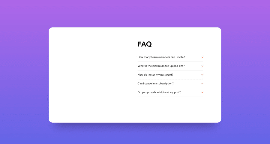
Any feedback would be welcome! I initially included the illustration in img tags, then changed my mind and included them in css as background images, not sure which approach is better in this situation.
Also: can someone suggest why images are not showing up in the screenshot? I've included them in my repo, and I can see them when I open the deployed page in Vercel, not sure what's gone wrong between here and there! Thanks :)
Community feedback
- @AgataLiberskaPosted almost 4 years ago
I have added a different view for tablets and edited media queries, I think it looks better. However, I still have a problem with the image not being centered on screens smaller than 375px. I think the issue is that the svg file has whitespace on the left so I can't simply center it within a container or relative to the card. I probably put myself in that corner but I can't find a way out, any suggestions? (Haven't updated js to open multiple q's at once yet, that + scrollbar is next on my list)
1@ApplePieGiraffePosted almost 4 years ago@AgataLiberska
Take a look at this article on positioning things in CSS. You can center things using absolute positioning by using percentage values and the
transform
property. That might help you in this case, but you might have to decrease the size of the illustration for very small screens. 😉0 - @ApplePieGiraffePosted almost 4 years ago
Hello, Agata Liberska! 👋
Just wanted to say, good work on this challenge! 👍 I like the smooth transition of opening/closing different FAQs! 😉
Like grace-snow mentioned, it would be nice if you transitioned to a mobile-friendly layout a little lower than
90em
, since there's still plenty of space for the desktop version of the accordion card for a while. 😉Keep coding (and happy coding, too)! 😁
1@AgataLiberskaPosted almost 4 years ago@ApplePieGiraffe thank you very much! I think I improved it now :)
0 - @grace-snowPosted almost 4 years ago
Hi, My main feedback is that 1440px (90rem) is way too late to be introducing the desktop layout. On my desktop, for example, I'm still seeing the mobile version even though there's loads of space
Equally, my mobile is narrower than your mobile layout, so with the way you've positioned the woman image, it is off to the left, not centered on my mobile screen.
One more point on mobile - the body background isn't stretching to fill the available space. Swap height 100vh for min-height 100vh
1@grace-snowPosted almost 4 years agoMost important of all, this really needs to be made keyboard accessible. If you had buttons wrapping the question + img, with an event listener on that button instead that would solve it :)
1@grace-snowPosted almost 4 years agoOne more :)
It's an optional point I guess, but the standard UI for expandable sections/accordions is to allow multiple to be opened at once. What you've built here is more like a stacked tab interface where only one item can be visible at a time. Could raise UX issues...
1@AgataLiberskaPosted almost 4 years ago@grace-snow regarding the last issue, I did it mostly to remind myself how to get that effect in JS, I didn't even think about UX, but now that you said it it makes so much sense. Thank you for all your feedback, I'm going to work on it straight away!
0@grace-snowPosted almost 4 years ago@AgataLiberska one thing that's different in this design I guess is that on desktop, you probably won't want the white card to grow as the questions are expanded... So I guess you might need a scrollbar to appear inside the card if needed? Maybe?
1@AgataLiberskaPosted almost 4 years ago@grace-snow I'll see what I can do :) thank you again, you're the best!
Can I ask a question regarding one of your previous suggestions? The way I had it set up originally, the entire item (question + answer) was clickable - so you could click on the answer to collapse the item. Now, I added buttons for accessibility as you'd suggested and an event listener on the buttons. I am wondering though, should I add an extra event listener on the answer to allow users to collapse them that way, too? Is there a standard way to approach this?
0@grace-snowPosted almost 4 years ago@AgataLiberska no the button would be enough and is more usual ui ☺
1
Please log in to post a comment
Log in with GitHubJoin our Discord community
Join thousands of Frontend Mentor community members taking the challenges, sharing resources, helping each other, and chatting about all things front-end!
Join our Discord