Submitted over 4 years ago
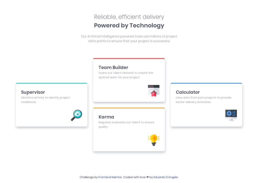
Responsive mobile first using HTML & CSS Flexbox
@eduardodangelo
Design comparison
SolutionDesign
Solution retrospective
Any feedback and suggestions would be appreciate it, thanks!
Community feedback
- @GerbenDolPosted over 4 years ago
Hey Eduardo, really nice job! It's looking really good on different kinds of resolutions. 💪🏻
Maybe add the background color to the body like in the design? And try making the borders on your cards flat on the bottom, instead of curved. They're flat in the design! 😁 (tip: you'll probably have to replace the border with a pseudo-element)
Thanks for the great solution! 👌
2
Please log in to post a comment
Log in with GitHubJoin our Discord community
Join thousands of Frontend Mentor community members taking the challenges, sharing resources, helping each other, and chatting about all things front-end!
Join our Discord
