Submitted over 1 year ago
Responsive mobile first UI using vanilla CSS (BEM)
#accessibility#bem#lighthouse#styled-components

@M-AminAlizadeh

Design comparison
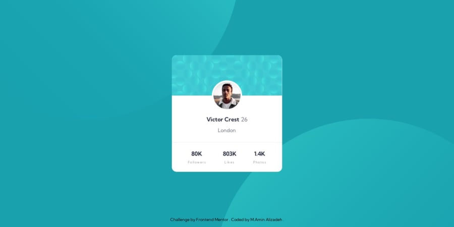
SolutionDesign

Solution retrospective
Hello, developers 👋🏼
In this project, I used simple HTML, CSS
I did these things in the project:
- Use the
BEMmethod for naming my classes in HTML - Use CSS variables
- Use relative units (
rem, %) instead of absolute units - Use
media queryto make the component responsive on all devices - Use
lighthouse,webhint, andstylelintas linters to the project - Mobile first
This project is so easy but it's also good for beginners to check that out If you see any issues or have any suggestions to make the code base better don't hesitate and write it down in the comment or click on this Issues Link and make an issue.
I'm looking for your comment
Happy coding
Cheers🎉
Community feedback
Please log in to post a comment
Log in with GitHub
Join our Discord community
Join thousands of Frontend Mentor community members taking the challenges, sharing resources, helping each other, and chatting about all things front-end!
Join our Discord