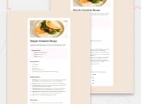
Design comparison
Solution retrospective
I am most proud of how quickly and easily I was able to complete everything. I am also quite proud of the mobile-first design approach that I used as this was my first time building something using that approach. And this was also my first time using css custom properties and they're pretty cool and very helpful. One thing I would do differently is I would plan things better before I actually start coding. I have a tendency of rushing into starting, although that's only because I don't want to "overplan", so I guess it's just about finding a balance.
What challenges did you encounter, and how did you overcome them?I didn't really face too many challenges, I guess there were just a few things that I had to search up, but it wasn't anything that I didn't end up finding a solution to/solving myself. I did struggle to decide how to go about writing my media queries. I also didn't know how to structure my html regarding the use of semantic html and the image specifically, but I ended up putting the image in a header tag on its own.
What specific areas of your project would you like help with?Due to this being my first time using a mobile-first design approach, the main thing I want feedback on is whether or not I went about it in the correct manner. I'm not really sure whether or not I wrote my media queries properly so I would like to know media query best practices. I would also like feedback on whether I used the css custom properties properly because this was also my first time using those. Lastly, I'm still trying to get a proper understanding of using semantic html, so any feedback on how I did regarding that would be appreciated.
Community feedback
- @RobertVeitPosted 3 days ago
Re: Semantic HTML
Consider using the HTML table structure for the nutrition table. For each row, the element on the left is a header for the value on the right. Using that markup will make it easier for someone using assistive technology to navigate through the data.
Marked as helpful1 - @RahexxPosted 4 days ago
Great job on this challenge!
Regarding your question about HTML: Your HTML structure is well-organized, especially with the use of semantic tags. I recommend reading about the BEM methodology for naming classes in your HTML. Additionally, instead of using empty
<div>elements for creating lines, consider using pseudo-elements (::beforeand::after). This way, you can avoid empty divs.Regarding your question about CSS: Your use of custom CSS is excellent—nice work! I suggest reading up on breakpoints; for example, check out this article: Bootstrap Breakpoints. You can also see how other services set breakpoints for reference.
Marked as helpful1@Chief-99Posted 4 days ago@Rahexx I don't know why I never thought to read up on naming classes because I always felt like my class names could be better, so thanks for the suggestion. Thank you for the comprehensive feedback I really appreciate it!
0
Please log in to post a comment
Log in with GitHubJoin our Discord community
Join thousands of Frontend Mentor community members taking the challenges, sharing resources, helping each other, and chatting about all things front-end!
Join our Discord

